


" height="35.33099999999999px" id="QN7VYQiqC" transform="translate(53 14)" width="90.73799713134767px"/><path d="M 31.22 13.948 L 31.22 34.908 L 22.41 34.908 L 22.41 14.597 C 22.41 10.29 20.745 7.905 17.445 7.637 L 8.85 7.637 L 8.85 34.91 L 0 34.91 L 0 0 L 19.82 0 C 27.385 0.164 31.22 4.852 31.22 13.95 Z" fill="rgb(255, 255, 255)" height="34.91000000000008px" id="X1FstgCoU" transform="translate(0 14)" width="31.220000000000027px"/><path d="M 0.001 0 L 8.78 0 L 8.78 49.096 L 0 49.096 L 0 0 Z M 128.076 49.095 C 124.848 49.095 121.949 48.324 119.4 46.782 C 116.84 45.24 114.815 43.132 113.325 40.48 C 111.844 37.818 111.104 34.796 111.104 31.403 C 111.104 28.052 111.844 25.05 113.325 22.398 C 114.805 19.736 116.84 17.628 119.4 16.086 C 121.949 14.534 124.848 13.773 128.076 13.773 C 131.129 13.773 133.915 14.329 136.433 15.439 C 138.952 16.559 140.915 18.122 142.334 20.137 L 137.492 25.924 C 136.598 24.68 135.344 23.621 133.75 22.748 C 132.157 21.864 130.553 21.432 128.909 21.432 C 127.099 21.432 125.506 21.864 124.108 22.748 C 122.71 23.621 121.61 24.814 120.818 26.315 C 120.017 27.815 119.616 29.512 119.616 31.403 C 119.616 33.295 120.027 34.991 120.849 36.481 C 121.628 37.95 122.785 39.185 124.2 40.059 C 125.619 40.933 127.212 41.375 128.981 41.375 C 130.656 41.375 132.208 40.995 133.617 40.244 C 135.046 39.504 136.331 38.434 137.492 37.057 L 142.334 42.855 C 140.874 44.736 138.849 46.258 136.259 47.388 C 133.681 48.523 130.893 49.105 128.076 49.095 Z M 71.712 14.174 C 70.746 14.174 69.79 14.225 68.937 14.379 C 66.511 14.647 64.393 15.346 62.409 16.477 C 59.716 17.977 57.567 20.064 56.056 22.747 C 54.504 25.379 53.692 28.432 53.692 31.814 C 53.692 35.247 54.504 38.3 56.056 40.932 C 57.567 43.615 59.387 45.712 62.08 47.213 C 64.825 48.765 70.993 49.978 74.221 47.861 C 78.219 45.25 75.978 40.655 75.978 40.655 C 74.632 41.518 72.997 41.847 71.383 41.847 C 69.615 41.847 68.053 41.425 66.706 40.511 C 65.308 39.647 64.558 38.475 63.807 36.964 C 63.005 35.464 62.625 33.746 62.625 31.824 C 62.625 29.881 63.005 28.174 63.807 26.674 C 64.526 25.21 65.645 23.981 67.035 23.128 C 67.631 22.758 68.279 22.408 68.978 22.192 C 69.831 21.925 70.756 21.822 71.712 21.822 L 80.563 21.822 C 80.563 21.822 80.584 45.712 80.553 46.874 C 80.522 48.056 80.45 48.416 80.162 50.06 C 79.535 53.638 76.071 56.228 70.582 56.228 C 68.649 56.228 66.819 55.961 64.989 55.375 C 63.026 54.748 62.378 54.409 60.754 53.432 L 57.68 59.847 C 59.243 60.987 61.052 62.057 63.489 62.817 C 66.032 63.605 68.68 64.004 71.342 64 C 76.986 64 81.396 62.18 84.624 59.179 C 87.79 56.177 89.404 51.942 89.404 46.359 L 89.404 14.175 L 71.712 14.175 Z" fill="rgb(255, 255, 255)" height="64.00003435645489px" id="ca2K3JIAR" transform="translate(38.5 0)" width="142.3339962768555px"/></g></svg>)
nlogic serves 90% of all Canadian broadcasters but, engineering resistance meant it took 11 months to code designs.
nlogic serves 90% of all Canadian broadcasters but, engineering resistance meant it took 11 months to code designs.
nlogic serves 90% of all Canadian broadcasters but, engineering resistance meant it took 11 months to code designs.
nlogic serves 90% of all Canadian broadcasters but, engineering resistance meant it took 11 months to code designs.
nlogic serves 90% of all Canadian broadcasters but, engineering resistance meant it took 11 months to code designs.
nlogic serves 90% of all Canadian broadcasters but, engineering resistance meant it took 11 months to code designs.
nlogic Canada delivers radio, television, and digital media reporting tools to the majority of Canada's broadcast industry. By 2019, its software had accumulated years of reactive engineering, multiple conflicting UI kits, and no design foundation. Making new features was an expensive, slow, and inconsistent process. As the sole product designer and design advocate, I led a full reinvention of the product suite. I designed and implementing an unified design system, overhauling the visual language across 4 products, and driving engineering buy-in through sustained advocacy. This resulted in reducing time to design accuracy from 11 months to 2 weeks. The design system also enabled the launch of Video Planner, the first new product generating 6-figures.
nlogic Canada delivers radio, television, and digital media reporting tools to the majority of Canada's broadcast industry. By 2019, its software had accumulated years of reactive engineering, multiple conflicting UI kits, and no design foundation. Making new features was an expensive, slow, and inconsistent process. As the sole product designer and design advocate, I led a full reinvention of the product suite. I designed and implementing an unified design system, overhauling the visual language across 4 products, and driving engineering buy-in through sustained advocacy. This resulted in reducing time to design accuracy from 11 months to 2 weeks. The design system also enabled the launch of Video Planner, the first new product generating 6-figures.
nlogic Canada delivers radio, television, and digital media reporting tools to the majority of Canada's broadcast industry. By 2019, its software had accumulated years of reactive engineering, multiple conflicting UI kits, and no design foundation. Making new features was an expensive, slow, and inconsistent process. As the sole product designer and design advocate, I led a full reinvention of the product suite. I designed and implementing an unified design system, overhauling the visual language across 4 products, and driving engineering buy-in through sustained advocacy. This resulted in reducing time to design accuracy from 11 months to 2 weeks. The design system also enabled the launch of Video Planner, the first new product generating 6-figures.
" height="63.84530584778305px" id="K_8oJYjsd" transform="translate(33.065 0.078)" width="114.85800319555513px"/><path d="M 15.284 0.076 C 17.753 0.196 20.971 1.429 22.831 3.119 C 24.405 4.547 25.618 6.073 26.36 8.102 C 27.053 9.995 27.712 12.005 27.718 14.117 L 27.78 34.026 L 22.049 34.088 C 21.75 34.094 21.433 33.761 21.433 33.428 L 21.423 14.98 C 21.423 14.33 21.27 13.676 21.19 13.047 C 20.916 10.923 20.007 8.876 18.295 7.55 C 15.57 5.444 10.445 5.87 7.385 6.733 C 7.08 6.819 6.415 7.1 6.415 7.46 L 6.405 34.054 L 0.077 34.066 L 0 30.795 L 0.006 6.075 L 0.028 2.749 C 1.617 1.969 3.24 1.324 4.992 0.951 C 5.832 0.773 6.667 0.532 7.502 0.415 C 10.562 -0.02 12.142 -0.075 15.283 0.075 Z" fill="rgb(220, 131, 31)" height="34.08837170698472px" id="MJMLcJ6P9" transform="translate(0.076 13.133)" width="27.779999999999973px"/></g></svg>)
" height="35.33099999999999px" id="l7YJrUUxL" transform="translate(53 14)" width="90.73799713134767px"/><path d="M 31.22 13.948 L 31.22 34.908 L 22.41 34.908 L 22.41 14.597 C 22.41 10.29 20.745 7.905 17.445 7.637 L 8.85 7.637 L 8.85 34.91 L 0 34.91 L 0 0 L 19.82 0 C 27.385 0.164 31.22 4.852 31.22 13.95 Z" fill="rgb(243, 94, 0)" height="34.91000000000008px" id="QymoJxYV3" transform="translate(0 14)" width="31.220000000000027px"/><path d="M 0.001 0 L 8.78 0 L 8.78 49.096 L 0 49.096 L 0 0 Z M 128.076 49.095 C 124.848 49.095 121.949 48.324 119.4 46.782 C 116.84 45.24 114.815 43.132 113.325 40.48 C 111.844 37.818 111.104 34.796 111.104 31.403 C 111.104 28.052 111.844 25.05 113.325 22.398 C 114.805 19.736 116.84 17.628 119.4 16.086 C 121.949 14.534 124.848 13.773 128.076 13.773 C 131.129 13.773 133.915 14.329 136.433 15.439 C 138.952 16.559 140.915 18.122 142.334 20.137 L 137.492 25.924 C 136.598 24.68 135.344 23.621 133.75 22.748 C 132.157 21.864 130.553 21.432 128.909 21.432 C 127.099 21.432 125.506 21.864 124.108 22.748 C 122.71 23.621 121.61 24.814 120.818 26.315 C 120.017 27.815 119.616 29.512 119.616 31.403 C 119.616 33.295 120.027 34.991 120.849 36.481 C 121.628 37.95 122.785 39.185 124.2 40.059 C 125.619 40.933 127.212 41.375 128.981 41.375 C 130.656 41.375 132.208 40.995 133.617 40.244 C 135.046 39.504 136.331 38.434 137.492 37.057 L 142.334 42.855 C 140.874 44.736 138.849 46.258 136.259 47.388 C 133.681 48.523 130.893 49.105 128.076 49.095 Z M 71.712 14.174 C 70.746 14.174 69.79 14.225 68.937 14.379 C 66.511 14.647 64.393 15.346 62.409 16.477 C 59.716 17.977 57.567 20.064 56.056 22.747 C 54.504 25.379 53.692 28.432 53.692 31.814 C 53.692 35.247 54.504 38.3 56.056 40.932 C 57.567 43.615 59.387 45.712 62.08 47.213 C 64.825 48.765 70.993 49.978 74.221 47.861 C 78.219 45.25 75.978 40.655 75.978 40.655 C 74.632 41.518 72.997 41.847 71.383 41.847 C 69.615 41.847 68.053 41.425 66.706 40.511 C 65.308 39.647 64.558 38.475 63.807 36.964 C 63.005 35.464 62.625 33.746 62.625 31.824 C 62.625 29.881 63.005 28.174 63.807 26.674 C 64.526 25.21 65.645 23.981 67.035 23.128 C 67.631 22.758 68.279 22.408 68.978 22.192 C 69.831 21.925 70.756 21.822 71.712 21.822 L 80.563 21.822 C 80.563 21.822 80.584 45.712 80.553 46.874 C 80.522 48.056 80.45 48.416 80.162 50.06 C 79.535 53.638 76.071 56.228 70.582 56.228 C 68.649 56.228 66.819 55.961 64.989 55.375 C 63.026 54.748 62.378 54.409 60.754 53.432 L 57.68 59.847 C 59.243 60.987 61.052 62.057 63.489 62.817 C 66.032 63.605 68.68 64.004 71.342 64 C 76.986 64 81.396 62.18 84.624 59.179 C 87.79 56.177 89.404 51.942 89.404 46.359 L 89.404 14.175 L 71.712 14.175 Z" fill="rgb(5, 40, 69)" height="64.00003435645489px" id="O8vAgOM18" transform="translate(38.5 0)" width="142.3339962768555px"/></g></svg>)
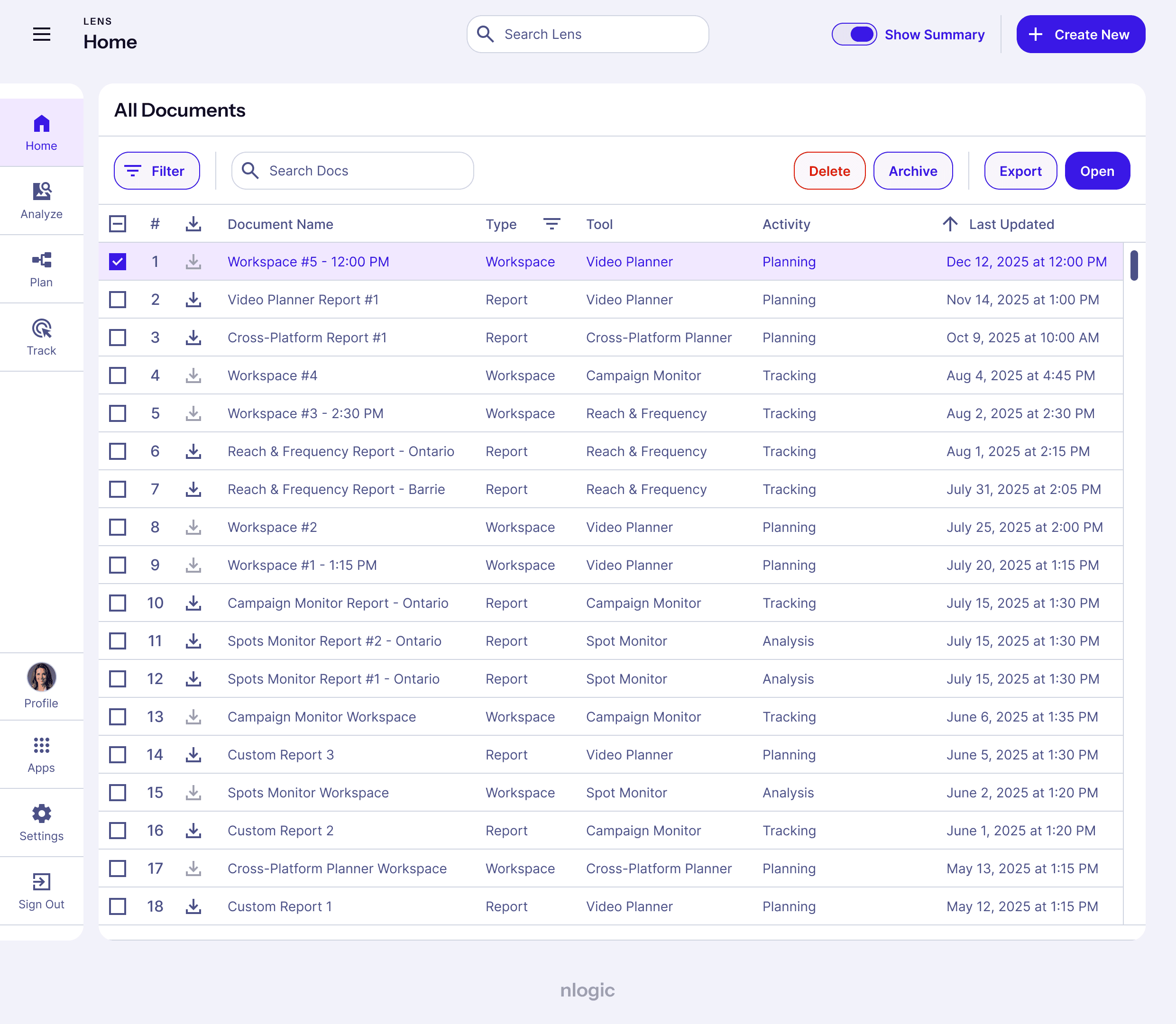
(First image) previous nlogic logo designed by a third-party. (Second image) redesigned nlogic logo designed by Mohamed Abdel Fattah. (Third image) the interface for “Video Planner”, a tool within nlogic’s flagship product “Lens” used for planning ad campaign performance on video platforms.
(First image) previous nlogic logo designed by a third-party. (Second image) redesigned nlogic logo designed by Mohamed Abdel Fattah. (Third image) the interface for “Video Planner”, a tool within nlogic’s flagship product “Lens” used for planning ad campaign performance on video platforms.
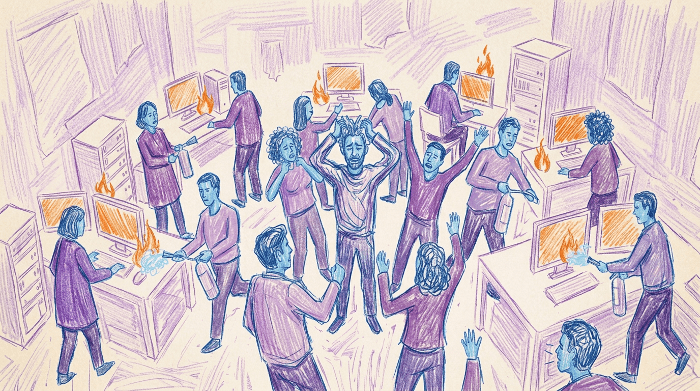
The company was stuck putting out fires;
design was an after-thought.
The company was stuck putting out fires; design was an after-thought.
The company was stuck putting out fires; design was an after-thought.
The company was stuck putting out fires;
design was an after-thought.
The company was stuck putting out fires; design was an after-thought.
The company was stuck putting out fires; design was an after-thought.
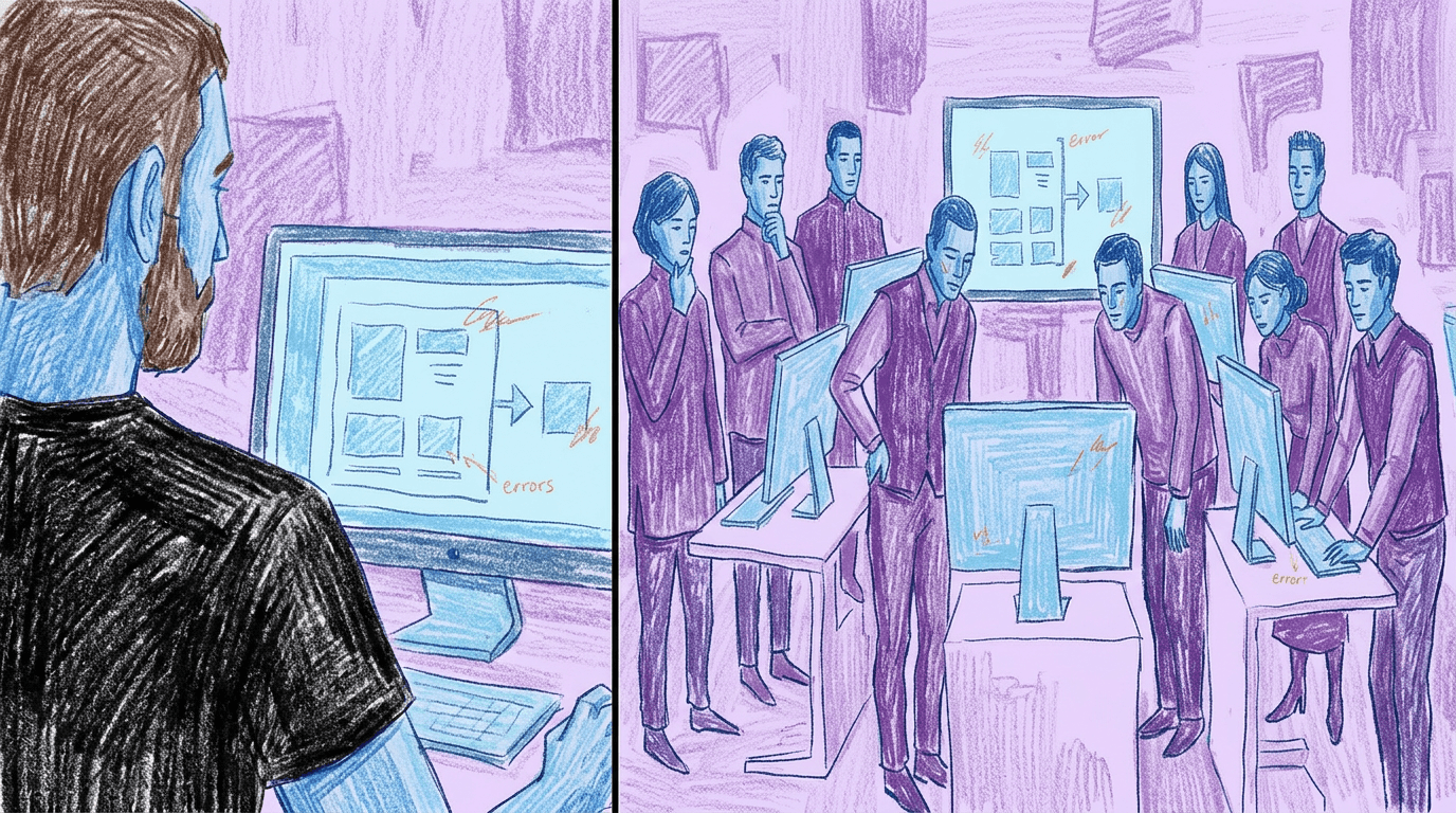
Three separate problems had calcified into one. Operations were slow, users were confused, and the product didn't reflect the business. nlogic's product suite had been built reactively since 2006. Features were added without a design foundation, resulting in multiple conflicting UI kits running simultaneously across 4 client-facing products. The engineering team, already stretched, was resistant to front-end work. This led to accumulating work-debt and made every UI change feel risky or expensive. Users experienced the result directly. The app was full of hidden menus, poor hierarchy, nested workflows and an interface that required heavy coaching from the client services department. The brand compounded the problem with a muted tone that felt disconnected from the company's lively culture.
Three separate problems had calcified into one. Operations were slow, users were confused, and the product didn't reflect the business. nlogic's product suite had been built reactively since 2006. Features were added without a design foundation, resulting in multiple conflicting UI kits running simultaneously across 4 client-facing products. The engineering team, already stretched, was resistant to front-end work. This led to accumulating work-debt and made every UI change feel risky or expensive. Users experienced the result directly. The app was full of hidden menus, poor hierarchy, nested workflows and an interface that required heavy coaching from the client services department. The brand compounded the problem with a muted tone that felt disconnected from the company's lively culture.
Three separate problems had calcified into one. Operations were slow, users were confused, and the product didn't reflect the business. nlogic's product suite had been built reactively since 2006. Features were added without a design foundation, resulting in multiple conflicting UI kits running simultaneously across 4 client-facing products. The engineering team, already stretched, was resistant to front-end work. This led to accumulating work-debt and made every UI change feel risky or expensive. Users experienced the result directly. The app was full of hidden menus, poor hierarchy, nested workflows and an interface that required heavy coaching from the client services department. The brand compounded the problem with a muted tone that felt disconnected from the company's lively culture.
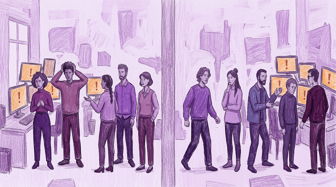
They had two types of users failing to streamline their work. Stakeholders complained about excess app maintenance.
They had two types of users failing to streamline their work. Stakeholders complained about excess app maintenance.
They had two types of users failing to streamline their work. Stakeholders complained about excess app maintenance.
They had two types of users failing to streamline their work. Stakeholders complained about excess app maintenance.
They had two types of users failing to streamline their work. Stakeholders complained about excess app maintenance.
They had two types of users failing to streamline their work. Stakeholders complained about excess app maintenance.
Nlogic serves two types of users, seasoned broadcast professionals and newcomers to the industry. Seasoned users are buyers and sellers across TV, radio, streaming, and cross platform channels. They rely on industry jargon and need software that matches their expertise. They expect it to be efficient and stay out of the way. Newer users are often recent graduates with expectations shaped by tools like Gmail, Google Docs, and Excel. They need an experience that feels familiar, is easy to learn and makes reporting feel creative rather than mechanical. I also considered four stakeholder groups, including Client Services, Marketing, Product Management and Engineering. Each group needs software that supports their goals and is easy to explain, adopt, and maintain.
Nlogic serves two types of users, seasoned broadcast professionals and newcomers to the industry. Seasoned users are buyers and sellers across TV, radio, streaming, and cross platform channels. They rely on industry jargon and need software that matches their expertise. They expect it to be efficient and stay out of the way. Newer users are often recent graduates with expectations shaped by tools like Gmail, Google Docs, and Excel. They need an experience that feels familiar, is easy to learn and makes reporting feel creative rather than mechanical. I also considered four stakeholder groups, including Client Services, Marketing, Product Management and Engineering. Each group needs software that supports their goals and is easy to explain, adopt, and maintain.
Nlogic serves two types of users, seasoned broadcast professionals and newcomers to the industry. Seasoned users are buyers and sellers across TV, radio, streaming, and cross platform channels. They rely on industry jargon and need software that matches their expertise. They expect it to be efficient and stay out of the way. Newer users are often recent graduates with expectations shaped by tools like Gmail, Google Docs, and Excel. They need an experience that feels familiar, is easy to learn and makes reporting feel creative rather than mechanical. I also considered four stakeholder groups, including Client Services, Marketing, Product Management and Engineering. Each group needs software that supports their goals and is easy to explain, adopt, and maintain.
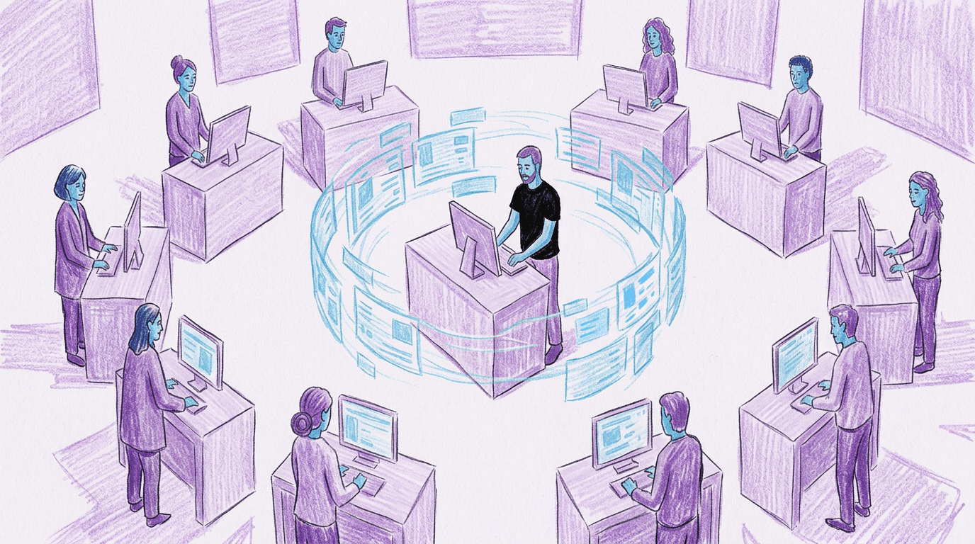
I was the sole designer owning the entire product design strategy, the design system, all product design initiatives and was also the company's design advocate.
I was the sole designer owning the entire product design strategy, the design system, all product design initiatives and was also the company's design advocate.
I was the sole designer owning the entire product design strategy, the design system, all product design initiatives and was also the company's design advocate.
I was the sole designer owning the entire product design strategy, the design system, all product design initiatives and was also the company's design advocate.
I was the sole designer owning the entire product design strategy, the design system, all product design initiatives and was also the company's design advocate.
I was the sole designer owning the entire product design strategy, the design system, all product design initiatives and was also the company's design advocate.
I became an expert in owning things end-to-end. I also led all stakeholder and user research, built information architecture, designed and tested components, built scalable systems for colour, type and documentation colour system and fostered cross-functional implementation. I even had redesigned the brand identity and led workshops on design to get other teammates up to speed creating compelling experiences.
I became an expert in owning things end-to-end. I also led all stakeholder and user research, built information architecture, designed and tested components, built scalable systems for colour, type and documentation colour system and fostered cross-functional implementation. I even had redesigned the brand identity and led workshops on design to get other teammates up to speed creating compelling experiences.
I became an expert in owning things end-to-end. I also led all stakeholder and user research, built information architecture, designed and tested components, built scalable systems for colour, type and documentation colour system and fostered cross-functional implementation. I even had redesigned the brand identity and led workshops on design to get other teammates up to speed creating compelling experiences.
Tech Stack
Tech Stack
Tech Stack
Research
ChatGPT
ChatGPT
ChatGPT
Creative
Figma
Adobe Photoshop
Adobe Illustrator
Figma
Adobe Photoshop
Adobe Illustrator
Figma
Adobe Photoshop
Adobe Illustrator
Figma
Adobe Photoshop
Adobe Illustrator
operations
Notion
Notion
Notion
I was the sole designer owning the entire product design strategy, the design system, all product design initiatives and was also the company's design advocate.
I became an expert in owning things end-to-end. I also led all stakeholder and user research, built information architecture, designed and tested components, built scalable systems for colour, type and documentation colour system and fostered cross-functional implementation. I even had redesigned the brand identity and led workshops on design to get other teammates up to speed creating compelling experiences.
Tech Stack
Research
ChatGPT
Creative
Figma
Adobe Photoshop
Adobe Illustrator
operations
Notion
The scope was shaped by engineering's resistance to front-end design work and creating an experience users would love.
The scope was shaped by engineering's resistance to front-end design work and creating an experience users would love.
The scope was shaped by engineering's resistance to front-end design work and creating an experience users would love.
The scope was shaped by engineering's resistance to front-end design work and creating an experience users would love.
The scope was shaped by engineering's resistance to front-end design work and creating an experience users would love.
The scope was shaped by engineering's resistance to front-end design work and creating an experience users would love.
In Scope
In Scope
In Scope
Design system
3 client-facing apps
1 internal admin app
Brand identity redesign
Documentation
Design advocacy
Design system
3 client-facing apps
1 internal admin app
Brand identity redesign
Documentation
Design advocacy
Design system
3 client-facing apps
1 internal admin app
Brand identity redesign
Documentation
Design advocacy
Out of Scope
Out of Scope
Out of Scope
Marketing material
Marketing material
Marketing material
I was initially asked to create mockups and prototypes based on existing product designs but, I questioned whether the underlying structure was efficient. I recognized that the initial design system slowed both users and internal teams. I proposed a new design language based on Google Material Design and created a single screen mockup that reimagined their flagship product "Lens." This established a clearer product vision and shifted the scope of work. I outlined the key projects and tasks needed to achieve that vision and led the creation of a full design system across four products, including Lens, Conex, RadTracker, and nlogic Permissions. The system included a component library, a structured color system, a unified typography scale, documentation and design-to-code translation. The main constraint was organizational, as the engineering team had significant front-end debt and resisted UI changes, so I ran workshops, demonstrated concepts in CSS, shared reference systems like Material Design and worked closely with a front-end developer to ensure accurate implementation.
I was initially asked to create mockups and prototypes based on existing product designs but, I questioned whether the underlying structure was efficient. I recognized that the initial design system slowed both users and internal teams. I proposed a new design language based on Google Material Design and created a single screen mockup that reimagined their flagship product "Lens." This established a clearer product vision and shifted the scope of work. I outlined the key projects and tasks needed to achieve that vision and led the creation of a full design system across four products, including Lens, Conex, RadTracker, and nlogic Permissions. The system included a component library, a structured color system, a unified typography scale, documentation and design-to-code translation. The main constraint was organizational, as the engineering team had significant front-end debt and resisted UI changes, so I ran workshops, demonstrated concepts in CSS, shared reference systems like Material Design and worked closely with a front-end developer to ensure accurate implementation.
I was initially asked to create mockups and prototypes based on existing product designs but, I questioned whether the underlying structure was efficient. I recognized that the initial design system slowed both users and internal teams. I proposed a new design language based on Google Material Design and created a single screen mockup that reimagined their flagship product "Lens." This established a clearer product vision and shifted the scope of work. I outlined the key projects and tasks needed to achieve that vision and led the creation of a full design system across four products, including Lens, Conex, RadTracker, and nlogic Permissions. The system included a component library, a structured color system, a unified typography scale, documentation and design-to-code translation. The main constraint was organizational, as the engineering team had significant front-end debt and resisted UI changes, so I ran workshops, demonstrated concepts in CSS, shared reference systems like Material Design and worked closely with a front-end developer to ensure accurate implementation.
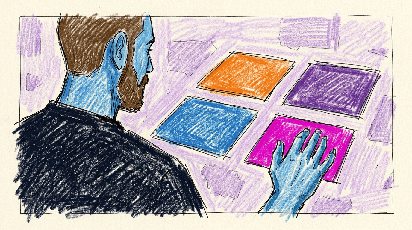
The key insight was that vividness could unify personality and functionality.
The key insight was that vividness could unify personality and functionality.
The key insight was that vividness could unify personality and functionality.
The key insight was that vividness could unify personality and functionality.
The key insight was that vividness could unify personality and functionality.
The key insight was that vividness could unify personality and functionality.
I started my process by finding the highest-leverage problems.
I started my process by finding the highest-leverage problems.
I started my process by finding the highest-leverage problems.
I started my process by finding the highest-leverage problems.
I started my process by finding the highest-leverage problems.
I started my process by finding the highest-leverage problems.
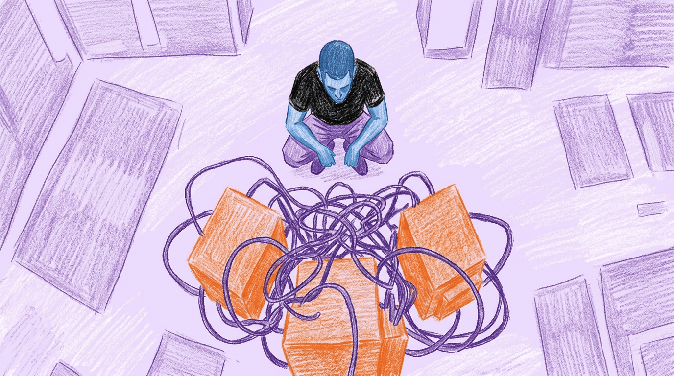
I began with a bird's-eye view audit for all the pressing problems with the nlogic products. The goal was to find the problems that, if solved, would make everything else easier or unnecessary to solve. I initially assumed the problems were solely product-related but, after a few conversations, I learned it was much bigger. I set up one-on-ones with the COO, product managers, engineers, account executives, sales, and end-users.
Here were the highest leverage issues:
Lens is the company's flagship product and the single product every other product was built on. It had multiple UI kits nested in the code that were creating many unnecessary issues in the product experience. They needed a single UI kit that was easy to build and manage.
Users ranged from expert to novice TV and Radio professionals who were passionate about their work. The conflicting UI kits created a bloated product experience that slowed momentum and required a lot of documentation from account executives. The products needed to be simplified and self-instructional to eliminate the need for excessive documentation.
The brand felt disconnected from the company's actual culture, professional but also playful. This meant sales pitches and marketing attempts fell flat once the clients started to use the apps; this would hurt long-term retention and brand advocacy. The brand needed to unify with the product experience to enliven the worker's experience.
I began with a bird's-eye view audit for all the pressing problems with the nlogic products. The goal was to find the problems that, if solved, would make everything else easier or unnecessary to solve. I initially assumed the problems were solely product-related but, after a few conversations, I learned it was much bigger. I set up one-on-ones with the COO, product managers, engineers, account executives, sales, and end-users.
Here were the highest leverage issues:
Lens is the company's flagship product and the single product every other product was built on. It had multiple UI kits nested in the code that were creating many unnecessary issues in the product experience. They needed a single UI kit that was easy to build and manage.
Users ranged from expert to novice TV and Radio professionals who were passionate about their work. The conflicting UI kits created a bloated product experience that slowed momentum and required a lot of documentation from account executives. The products needed to be simplified and self-instructional to eliminate the need for excessive documentation.
The brand felt disconnected from the company's actual culture, professional but also playful. This meant sales pitches and marketing attempts fell flat once the clients started to use the apps; this would hurt long-term retention and brand advocacy. The brand needed to unify with the product experience to enliven the worker's experience.
I began with a bird's-eye view audit for all the pressing problems with the nlogic products. The goal was to find the problems that, if solved, would make everything else easier or unnecessary to solve. I initially assumed the problems were solely product-related but, after a few conversations, I learned it was much bigger. I set up one-on-ones with the COO, product managers, engineers, account executives, sales, and end-users.
Here were the highest leverage issues:
Lens is the company's flagship product and the single product every other product was built on. It had multiple UI kits nested in the code that were creating many unnecessary issues in the product experience. They needed a single UI kit that was easy to build and manage.
Users ranged from expert to novice TV and Radio professionals who were passionate about their work. The conflicting UI kits created a bloated product experience that slowed momentum and required a lot of documentation from account executives. The products needed to be simplified and self-instructional to eliminate the need for excessive documentation.
The brand felt disconnected from the company's actual culture, professional but also playful. This meant sales pitches and marketing attempts fell flat once the clients started to use the apps; this would hurt long-term retention and brand advocacy. The brand needed to unify with the product experience to enliven the worker's experience.
I began with a bird's-eye view audit for all the pressing problems with the nlogic products. The goal was to find the problems that, if solved, would make everything else easier or unnecessary to solve. I initially assumed the problems were solely product-related but, after a few conversations, I learned it was much bigger. I set up one-on-ones with the COO, product managers, engineers, account executives, sales, and end-users.
Here were the highest leverage issues:
Lens is the company's flagship product and the single product every other product was built on. It had multiple UI kits nested in the code that were creating many unnecessary issues in the product experience. They needed a single UI kit that was easy to build and manage.
Users ranged from expert to novice TV and Radio professionals who were passionate about their work. The conflicting UI kits created a bloated product experience that slowed momentum and required a lot of documentation from account executives. The products needed to be simplified and self-instructional to eliminate the need for excessive documentation.
The brand felt disconnected from the company's actual culture, professional but also playful. This meant sales pitches and marketing attempts fell flat once the clients started to use the apps; this would hurt long-term retention and brand advocacy. The brand needed to unify with the product experience to enliven the worker's experience.
I began with a bird's-eye view audit for all the pressing problems with the nlogic products. The goal was to find the problems that, if solved, would make everything else easier or unnecessary to solve. I initially assumed the problems were solely product-related but, after a few conversations, I learned it was much bigger. I set up one-on-ones with the COO, product managers, engineers, account executives, sales, and end-users.
Here were the highest leverage issues:
Lens is the company's flagship product and the single product every other product was built on. It had multiple UI kits nested in the code that were creating many unnecessary issues in the product experience. They needed a single UI kit that was easy to build and manage.
Users ranged from expert to novice TV and Radio professionals who were passionate about their work. The conflicting UI kits created a bloated product experience that slowed momentum and required a lot of documentation from account executives. The products needed to be simplified and self-instructional to eliminate the need for excessive documentation.
The brand felt disconnected from the company's actual culture, professional but also playful. This meant sales pitches and marketing attempts fell flat once the clients started to use the apps; this would hurt long-term retention and brand advocacy. The brand needed to unify with the product experience to enliven the worker's experience.
I began with a bird's-eye view audit for all the pressing problems with the nlogic products. The goal was to find the problems that, if solved, would make everything else easier or unnecessary to solve. I initially assumed the problems were solely product-related but, after a few conversations, I learned it was much bigger. I set up one-on-ones with the COO, product managers, engineers, account executives, sales, and end-users.
Here were the highest leverage issues:
Lens is the company's flagship product and the single product every other product was built on. It had multiple UI kits nested in the code that were creating many unnecessary issues in the product experience. They needed a single UI kit that was easy to build and manage.
Users ranged from expert to novice TV and Radio professionals who were passionate about their work. The conflicting UI kits created a bloated product experience that slowed momentum and required a lot of documentation from account executives. The products needed to be simplified and self-instructional to eliminate the need for excessive documentation.
The brand felt disconnected from the company's actual culture, professional but also playful. This meant sales pitches and marketing attempts fell flat once the clients started to use the apps; this would hurt long-term retention and brand advocacy. The brand needed to unify with the product experience to enliven the worker's experience.
I created muscle memory with 2 layout patterns across all apps.
I created muscle memory with 2 layout patterns across all apps.
I created muscle memory with 2 layout patterns across all apps.
I created muscle memory with 2 layout patterns across all apps.
I created muscle memory with 2 layout patterns across all apps.
I created muscle memory with 2 layout patterns across all apps.
I made the deliberate choice to tackle nlogic's flagship product first. Lens was the most complex app in the suite. It had hidden menus, deeply nested components and multiple colours for the same action. Through stakeholder sessions and user analysis, I distilled the entire product into two core layout patterns. one for creation, one for review. I then analyzed the remaining products to see if the patterns translate to the other apps. They did. Having similar layout patterns across all apps would create muscle memory for users. This also reduced cognitive load when using a single tool and switching between tools.
I made the deliberate choice to tackle nlogic's flagship product first. Lens was the most complex app in the suite. It had hidden menus, deeply nested components and multiple colours for the same action. Through stakeholder sessions and user analysis, I distilled the entire product into two core layout patterns. one for creation, one for review. I then analyzed the remaining products to see if the patterns translate to the other apps. They did. Having similar layout patterns across all apps would create muscle memory for users. This also reduced cognitive load when using a single tool and switching between tools.
I made the deliberate choice to tackle nlogic's flagship product first. Lens was the most complex app in the suite. It had hidden menus, deeply nested components and multiple colours for the same action. Through stakeholder sessions and user analysis, I distilled the entire product into two core layout patterns. one for creation, one for review. I then analyzed the remaining products to see if the patterns translate to the other apps. They did. Having similar layout patterns across all apps would create muscle memory for users. This also reduced cognitive load when using a single tool and switching between tools.
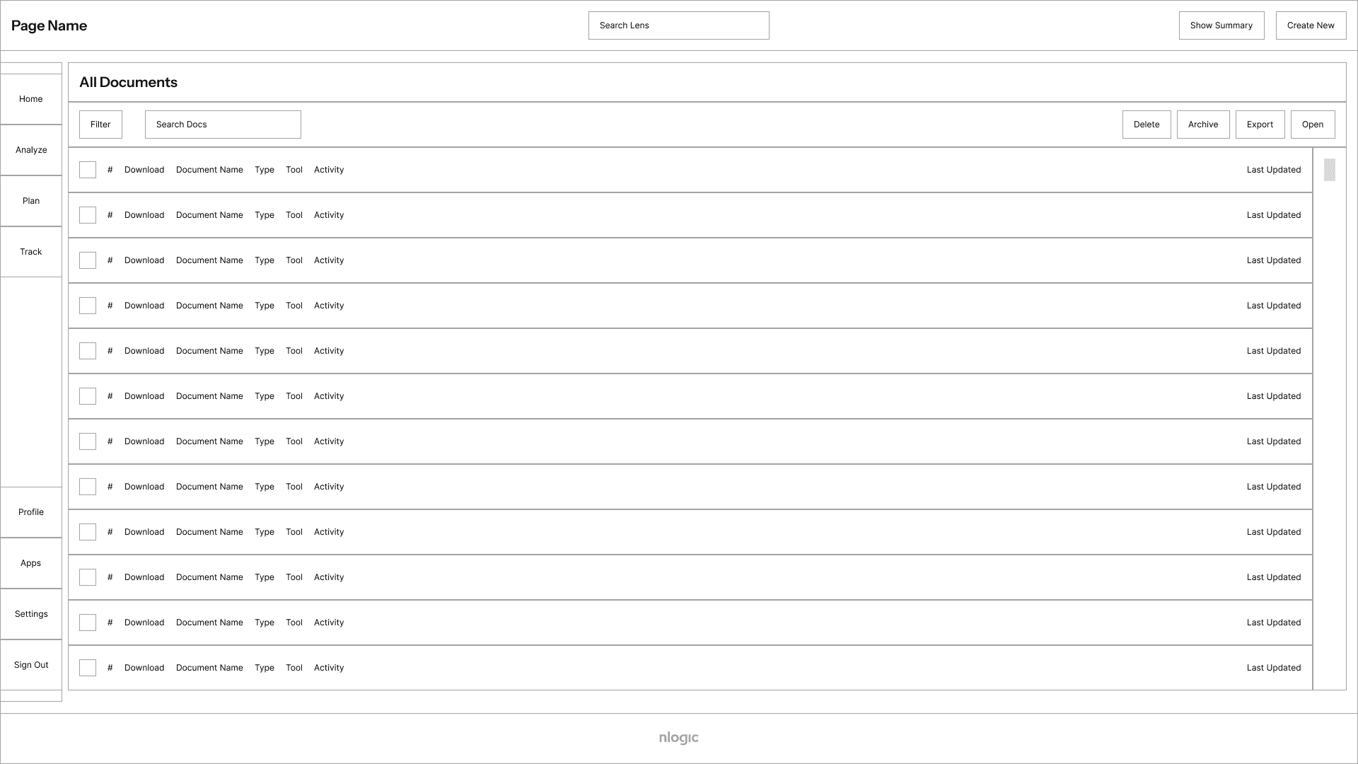
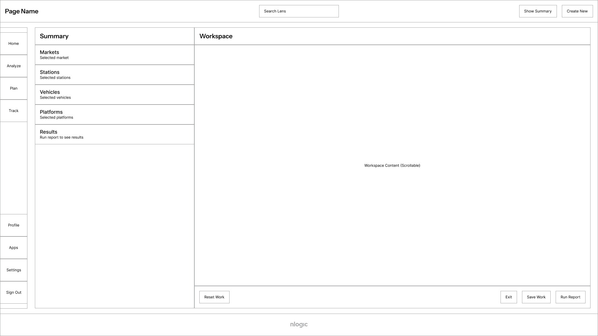
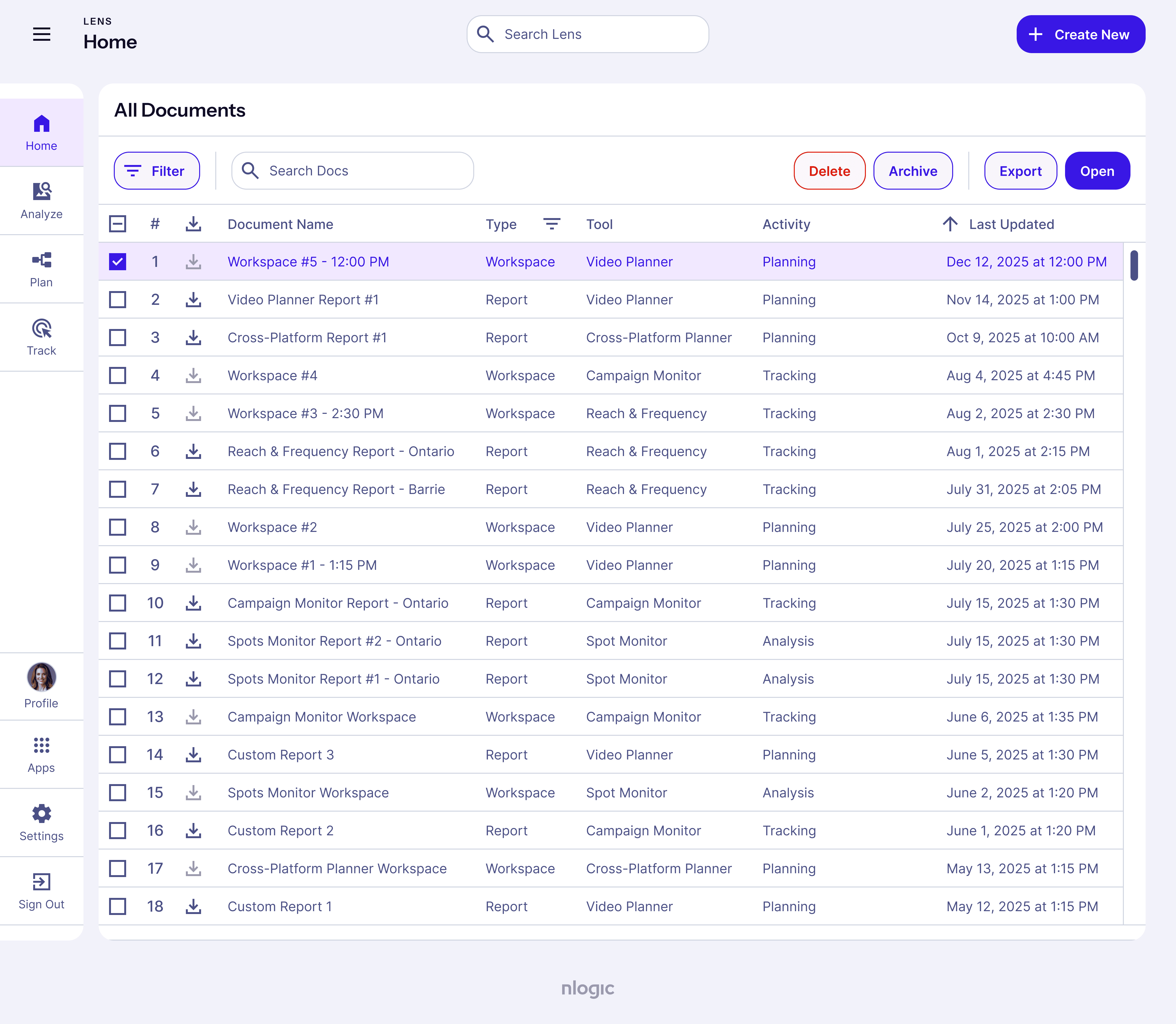
Wireframes I designed starting with nlogic's flagship product "Lens." I tested the layout amongst the other apps and found all functionalities could fit in easily using the same layout.
Colour became a tool for instruction.
Colour became a tool for instruction.
Colour became a tool for instruction.
Colour became a tool for instruction.
Colour became a tool for instruction.
Colour became a tool for instruction.
The initial products used colour inconsistently so I built a global colour database with over 600 unique values. I created a shared naming convention across all four products to generate consistent color schemes from that set. Color became a functional system rather than a visual choice. I applied a monochromatic approach to improve wayfinding, with primary actions using bold fills and secondary actions appearing less prominent. This reduced the reliance on instructions and lowered the need for training, saving time and cost. Beyond colour, all products shared a single type scale, component library and interaction states. With tokens mapped to code, engineers could implement changes without reinterpretation, reducing design-engineering time from 11 months to under 2 weeks.
The initial products used colour inconsistently so I built a global colour database with over 600 unique values. I created a shared naming convention across all four products to generate consistent color schemes from that set. Color became a functional system rather than a visual choice. I applied a monochromatic approach to improve wayfinding, with primary actions using bold fills and secondary actions appearing less prominent. This reduced the reliance on instructions and lowered the need for training, saving time and cost. Beyond colour, all products shared a single type scale, component library and interaction states. With tokens mapped to code, engineers could implement changes without reinterpretation, reducing design-engineering time from 11 months to under 2 weeks.
The initial products used colour inconsistently so I built a global colour database with over 600 unique values. I created a shared naming convention across all four products to generate consistent color schemes from that set. Color became a functional system rather than a visual choice. I applied a monochromatic approach to improve wayfinding, with primary actions using bold fills and secondary actions appearing less prominent. This reduced the reliance on instructions and lowered the need for training, saving time and cost. Beyond colour, all products shared a single type scale, component library and interaction states. With tokens mapped to code, engineers could implement changes without reinterpretation, reducing design-engineering time from 11 months to under 2 weeks.
lens / main / light-mode /
/ focus
/ emphasis-high
/ emphasis-mid
/ emphasis-low
/ border
/ surface
/ surface-button
/ background (bg)
/ bg-modal
/ state-hover
/ state-pressed
/ state-selected
…/ dark-mode /
/ focus
/ emphasis-high
/ emphasis-mid
/ emphasis-low
/ border
/ surface
/ surface-button
/ background (bg)
/ bg-modal
/ state-hover
/ state-pressed
/ state-selected
lens / alert / light-mode /
/ focus
/ emphasis-high
/ emphasis-mid
/ emphasis-low
/ border
/ surface
/ surface-button
/ background (bg)
/ bg-modal
/ state-hover
/ state-pressed
/ state-selected
…/ dark-mode /
/ focus
/ emphasis-high
/ emphasis-mid
/ emphasis-low
/ border
/ surface
/ surface-button
/ background (bg)
/ bg-modal
/ state-hover
/ state-pressed
/ state-selected
conex / …
radtracker / …
permissions / …
Product colours for Lens. I then followed the same structure for the other products. Systematic colour-picking improved wayfinding and muscle memory on all apps.
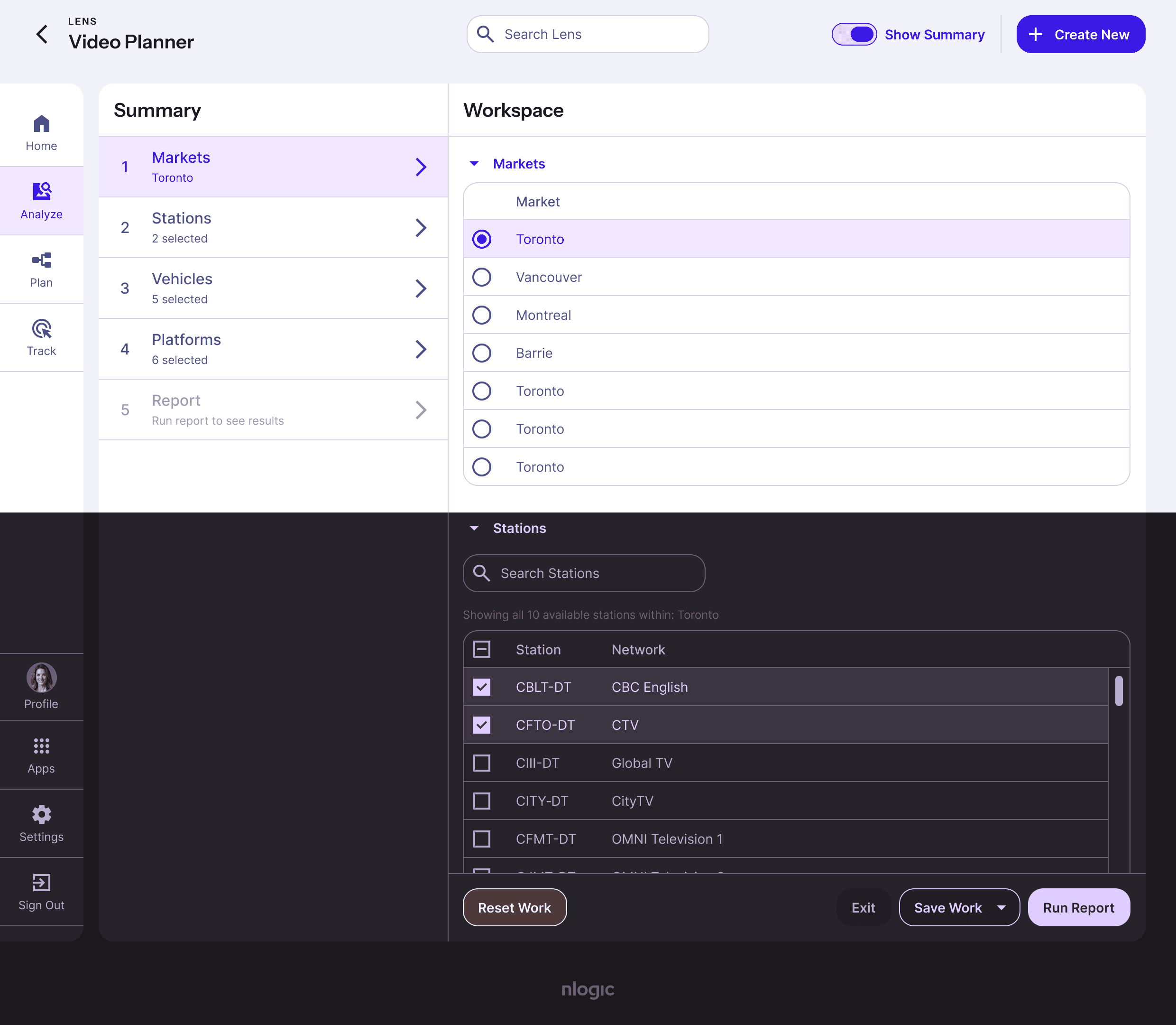
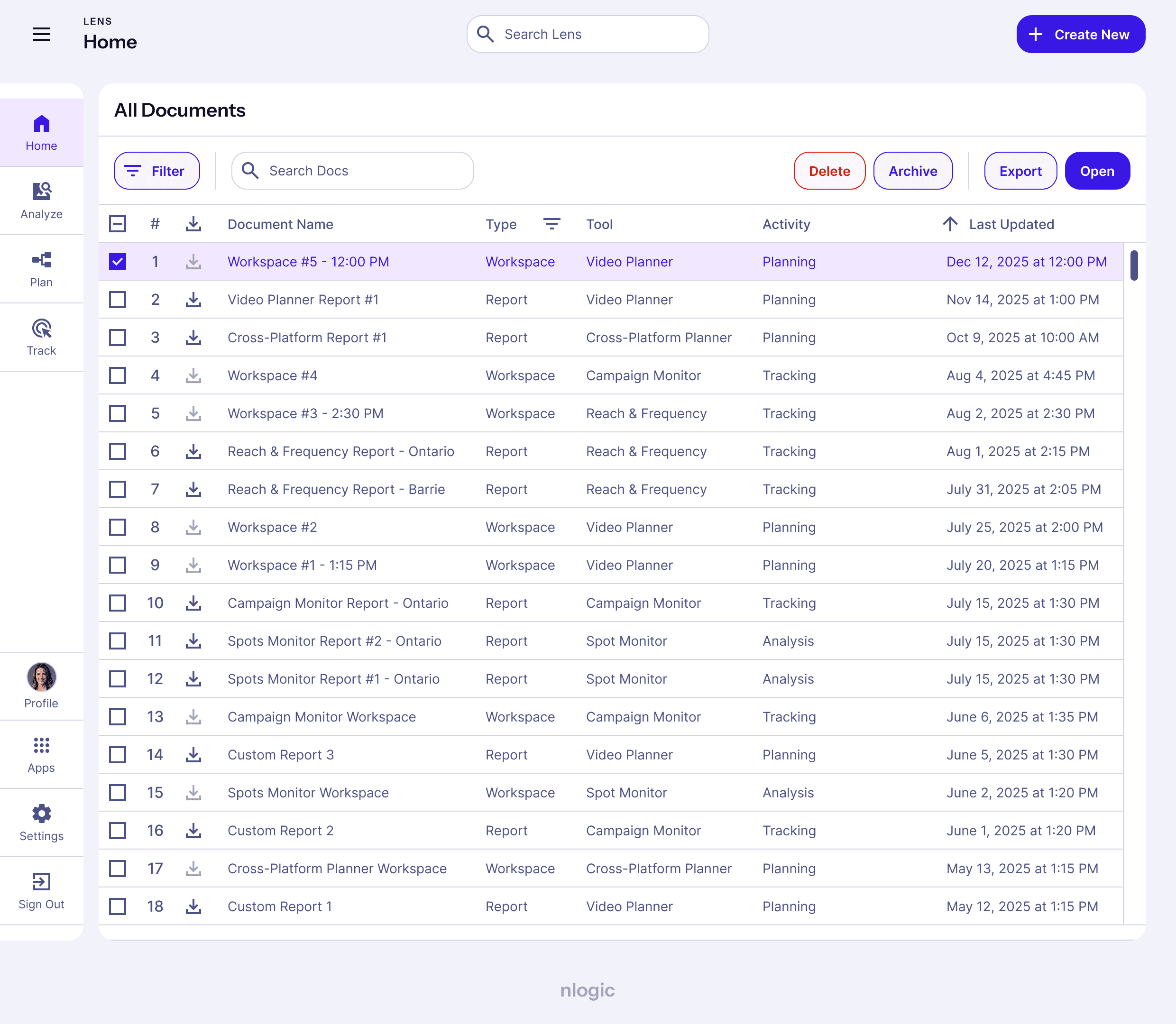
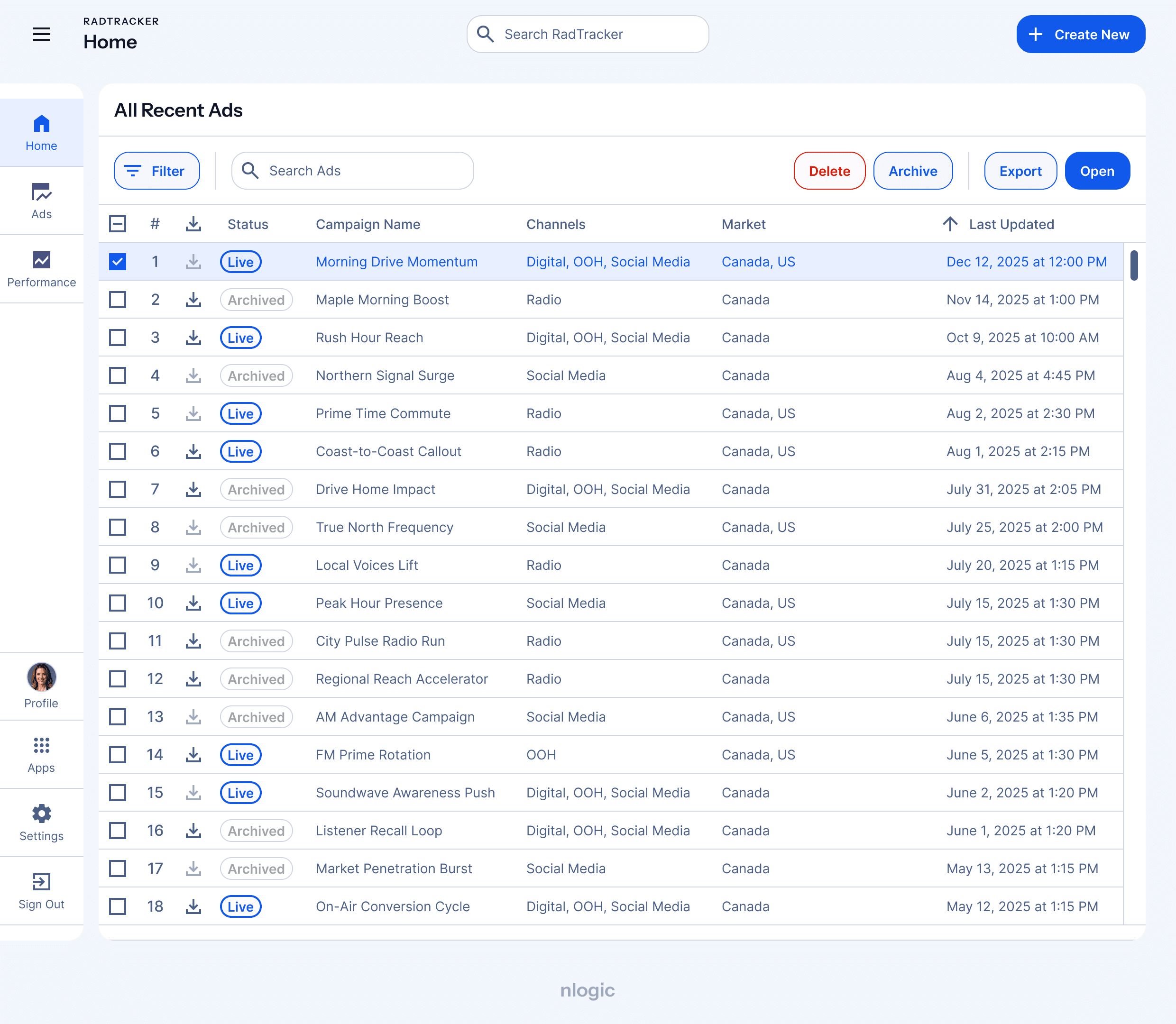
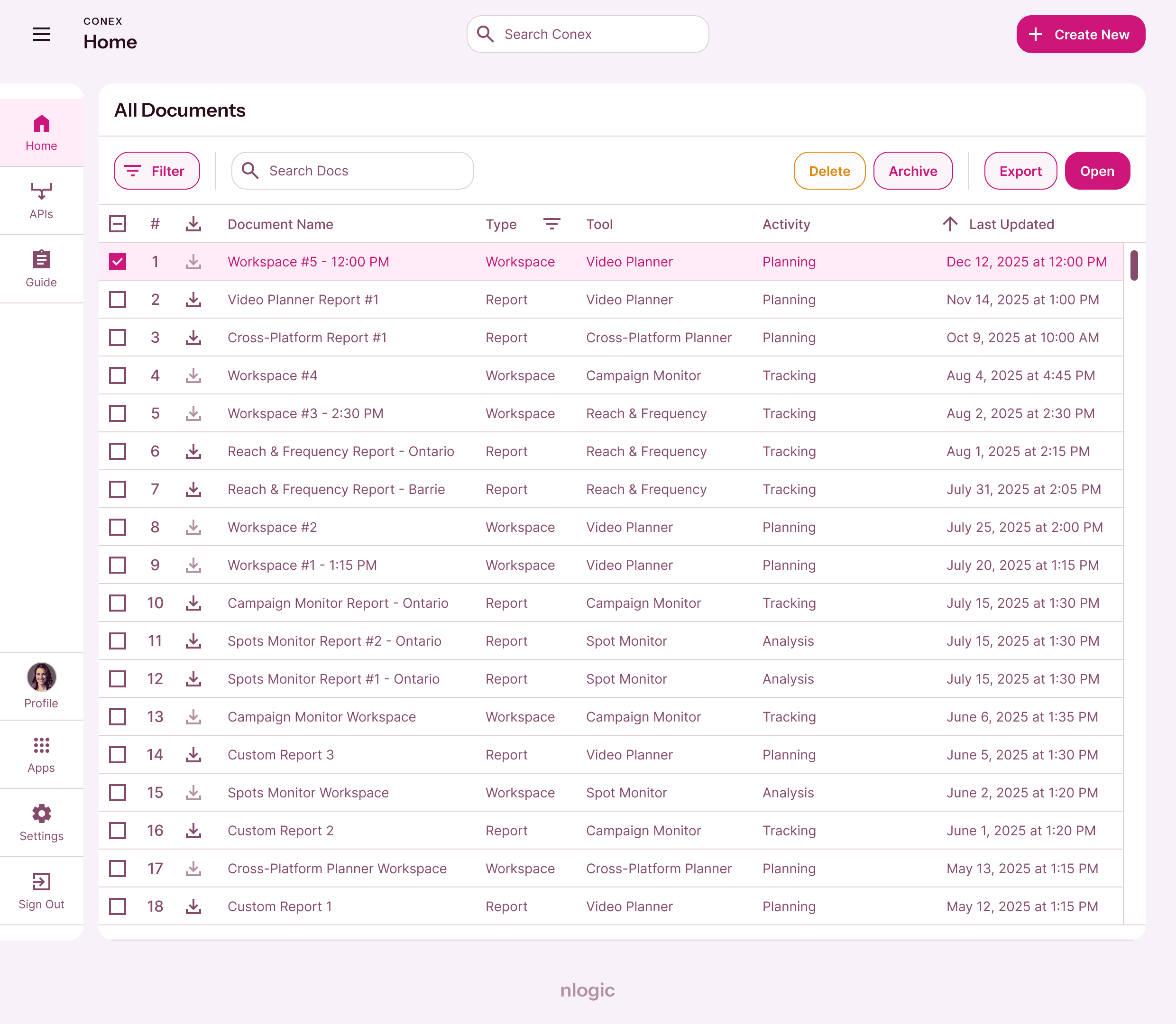
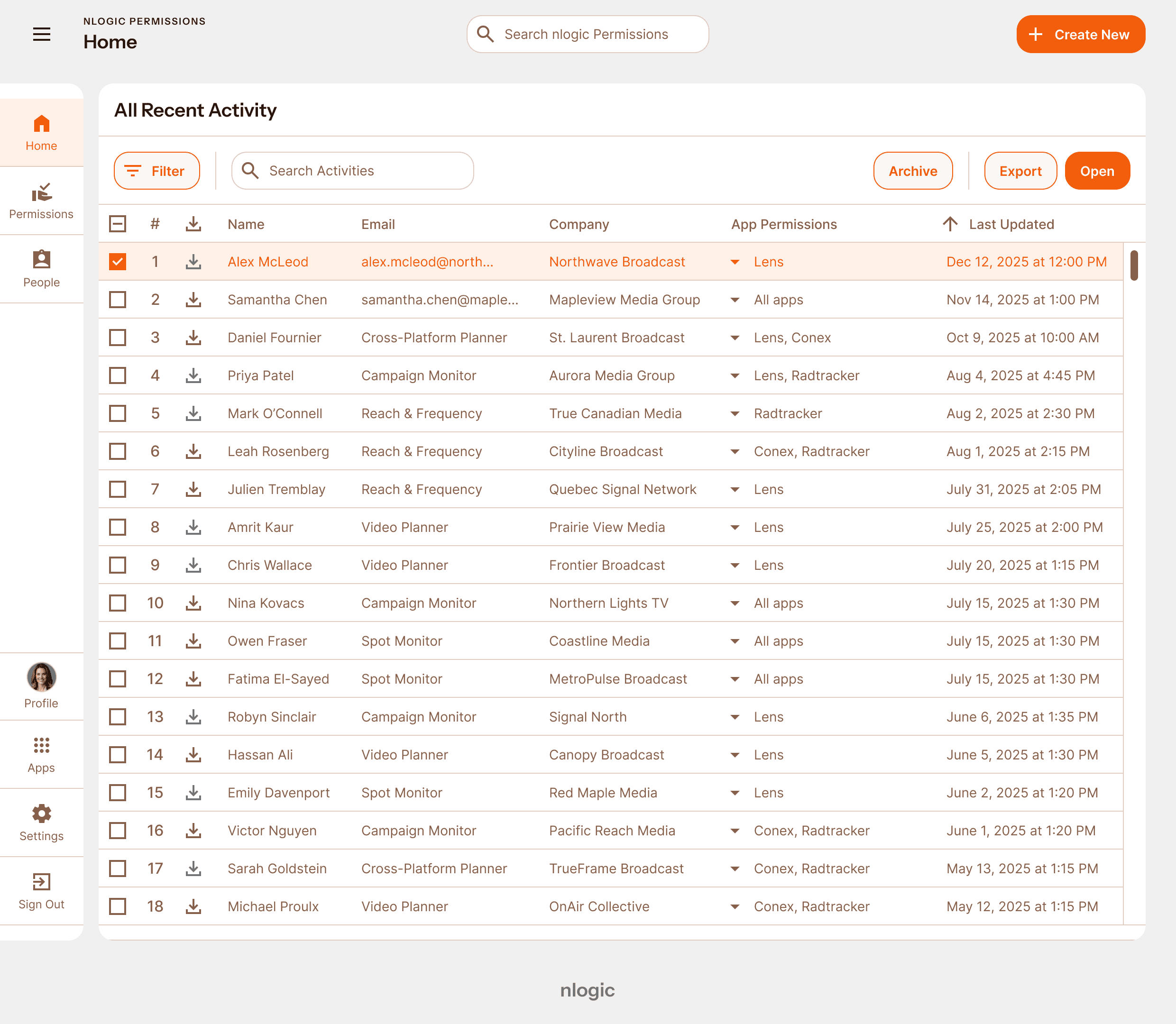
Light and dark mode of the Lens app; all the light modes of the other apps.
Instrument Sans
Semi-bold
64 px
Head 1
52 px
Head 2
48 px
Head 3
32 px
Head 4
24 px
Head 5
20 px
Head 6
14 px
Button
Instrument Sans
Medium
16 px
Subtitle 1
14 px
Subtitle 2
10 px
OVERLINE
Instrument Sans
Regular
16 px
Body 1
14 px
Body 2
12 px
Caption
All apps used a single type scale aimed at functionality with a hint of personality. Bolded text helped convey the bold personality of the company while acting as lever for better reading serving mature users of the product suite.
Type scale for PATI aiming for a scientific feel, treating workouts like experiments.
buttons-main
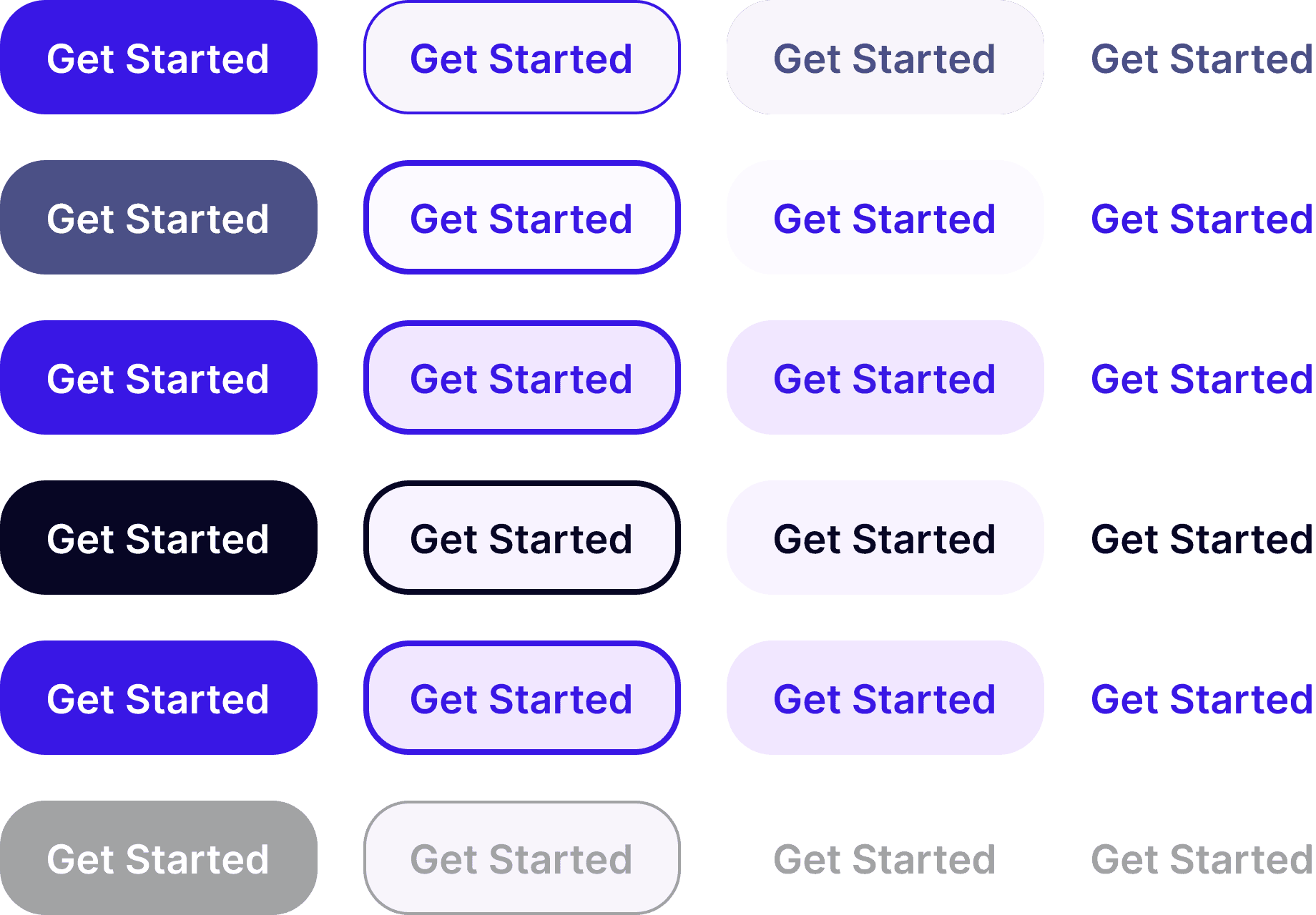
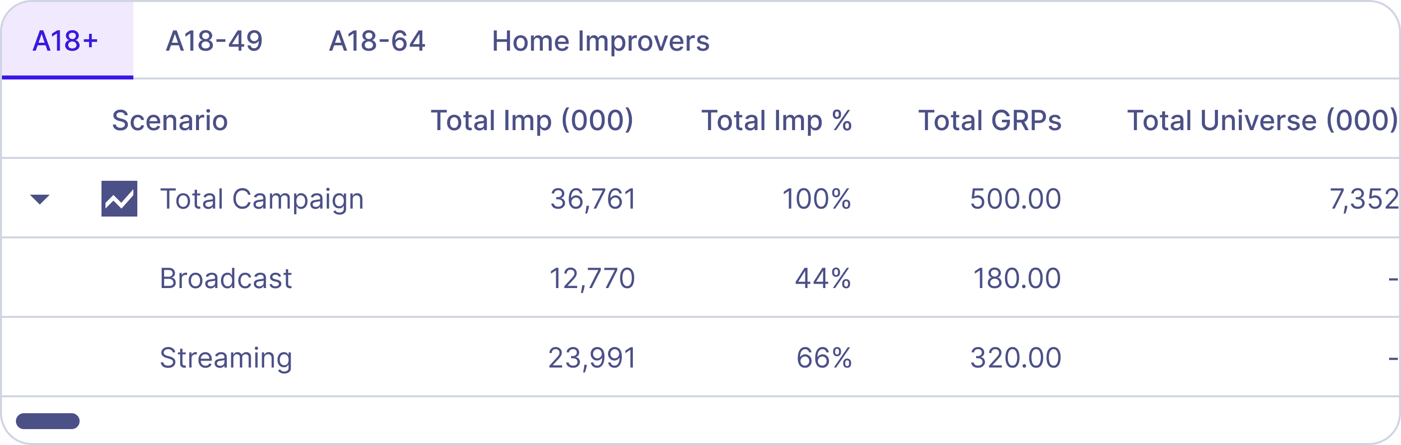
table-tabbed
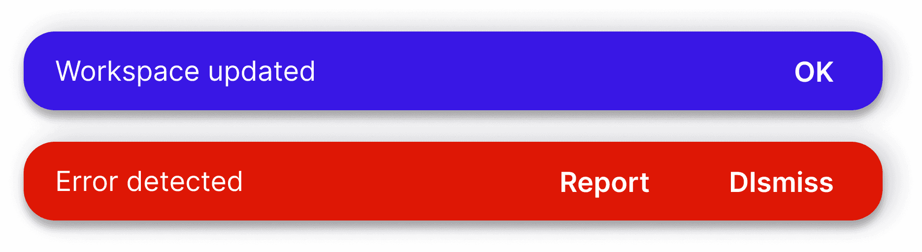
snackbars
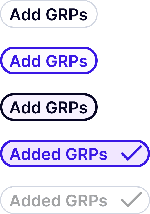
chips
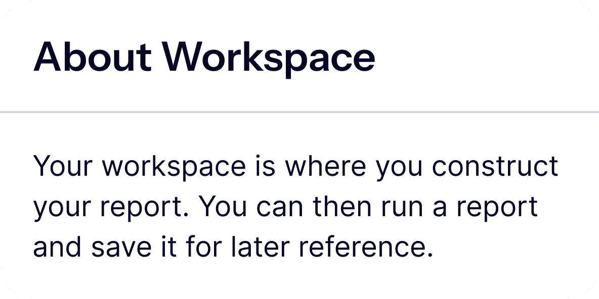
card
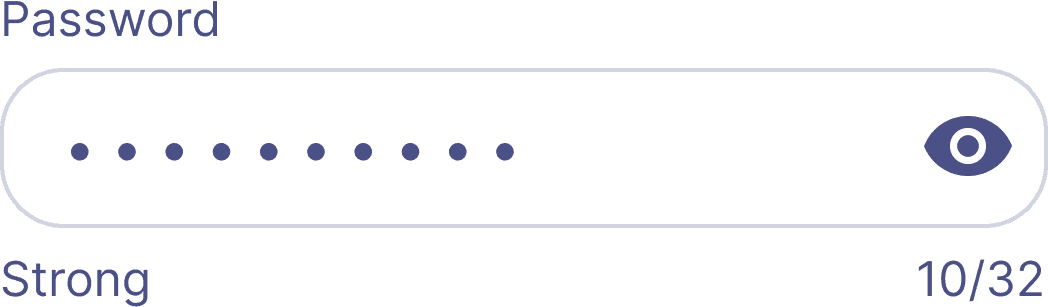
field
toggle
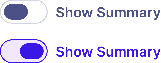
Samples of components used for Lens. The only difference between these components and ones used for other apps was the colour, retaining the muscle memory in its' core functionality.
Samples of components used for Lens. The only difference between these components and ones used for other apps was the colour, retaining the muscle memory in its' core functionality.
As a result, user flows flowed.
As a result, user flows flowed.
As a result, user flows flowed.
As a result, user flows flowed.
As a result, user flows flowed.
As a result, user flows flowed.
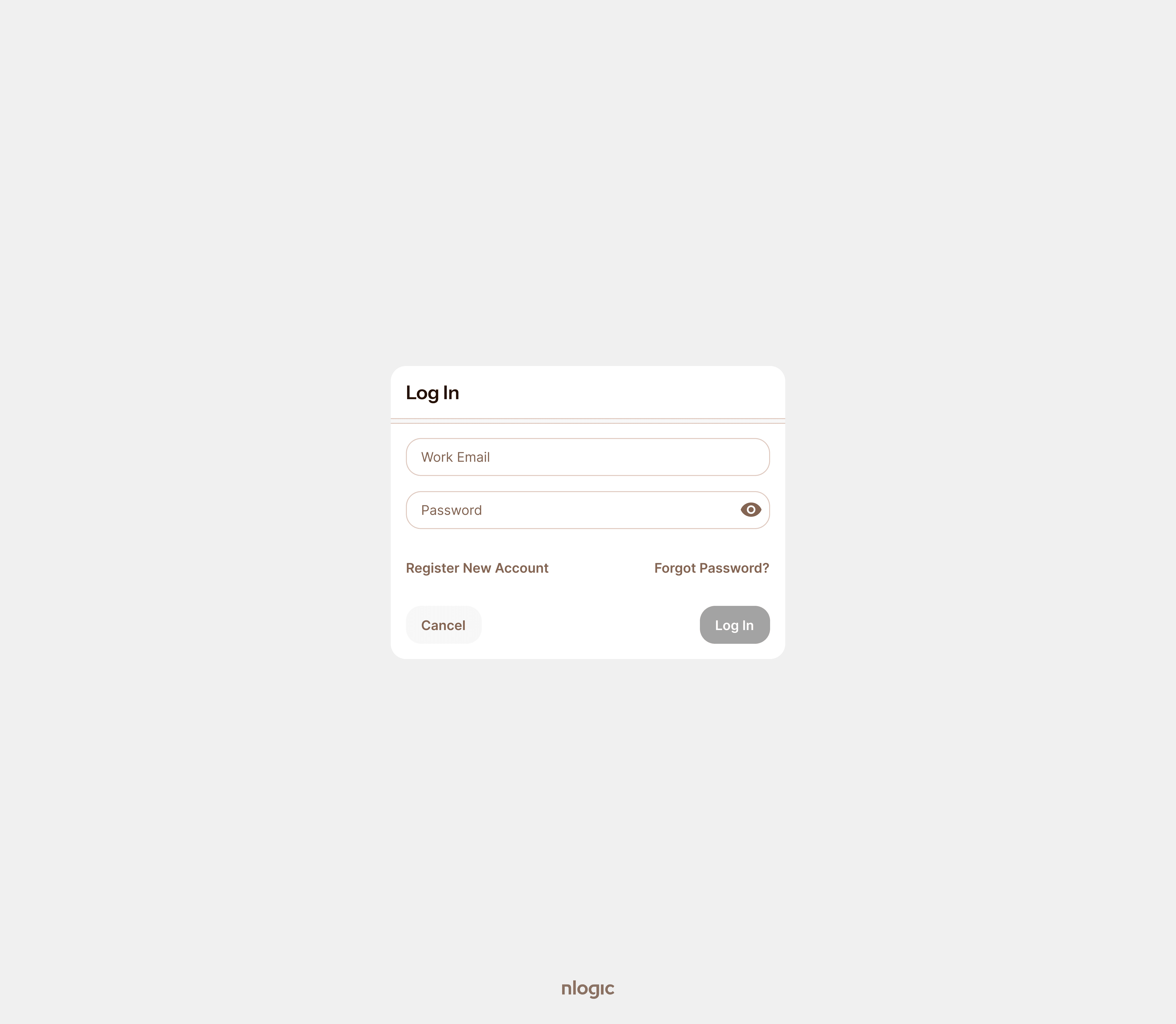
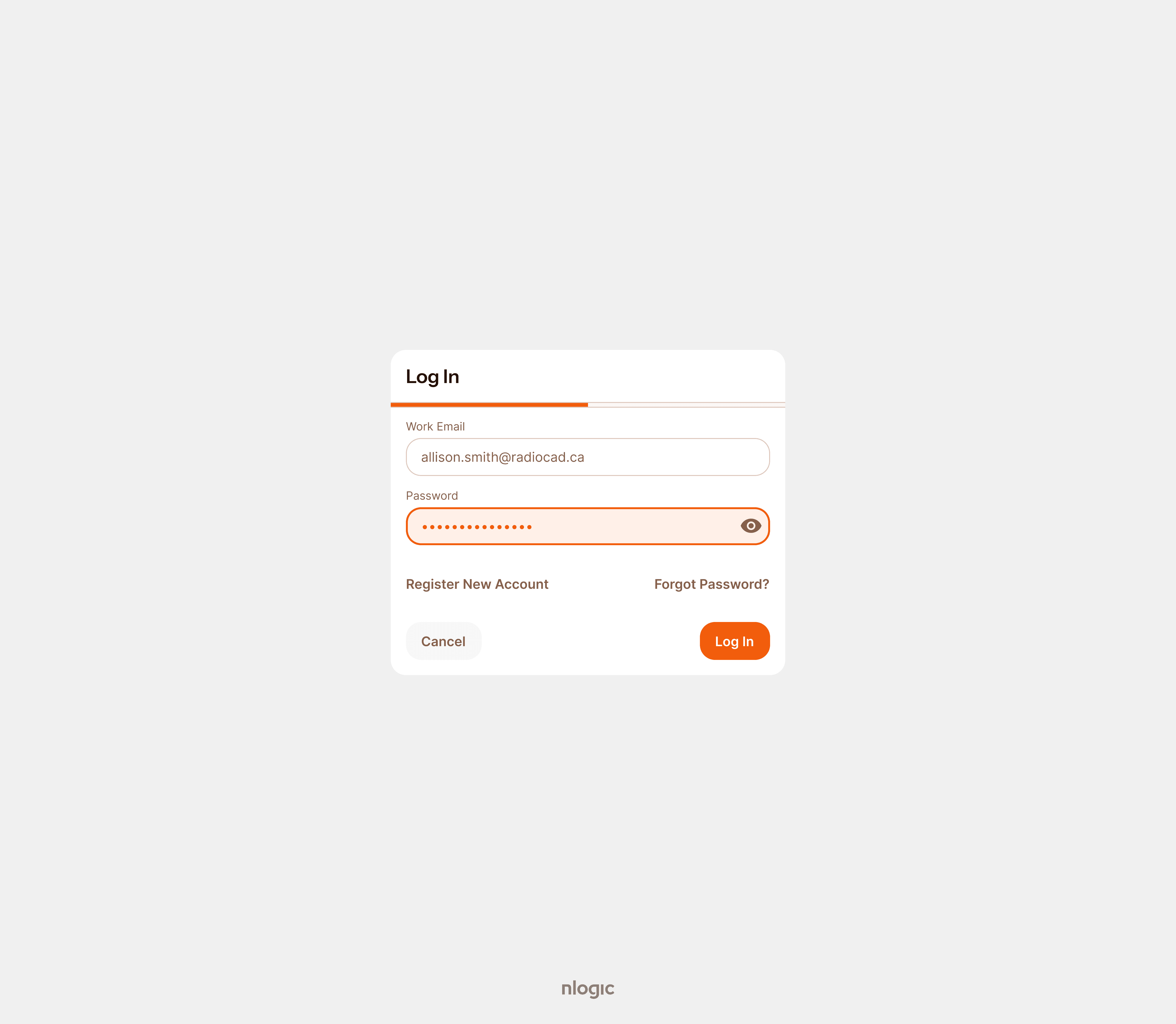
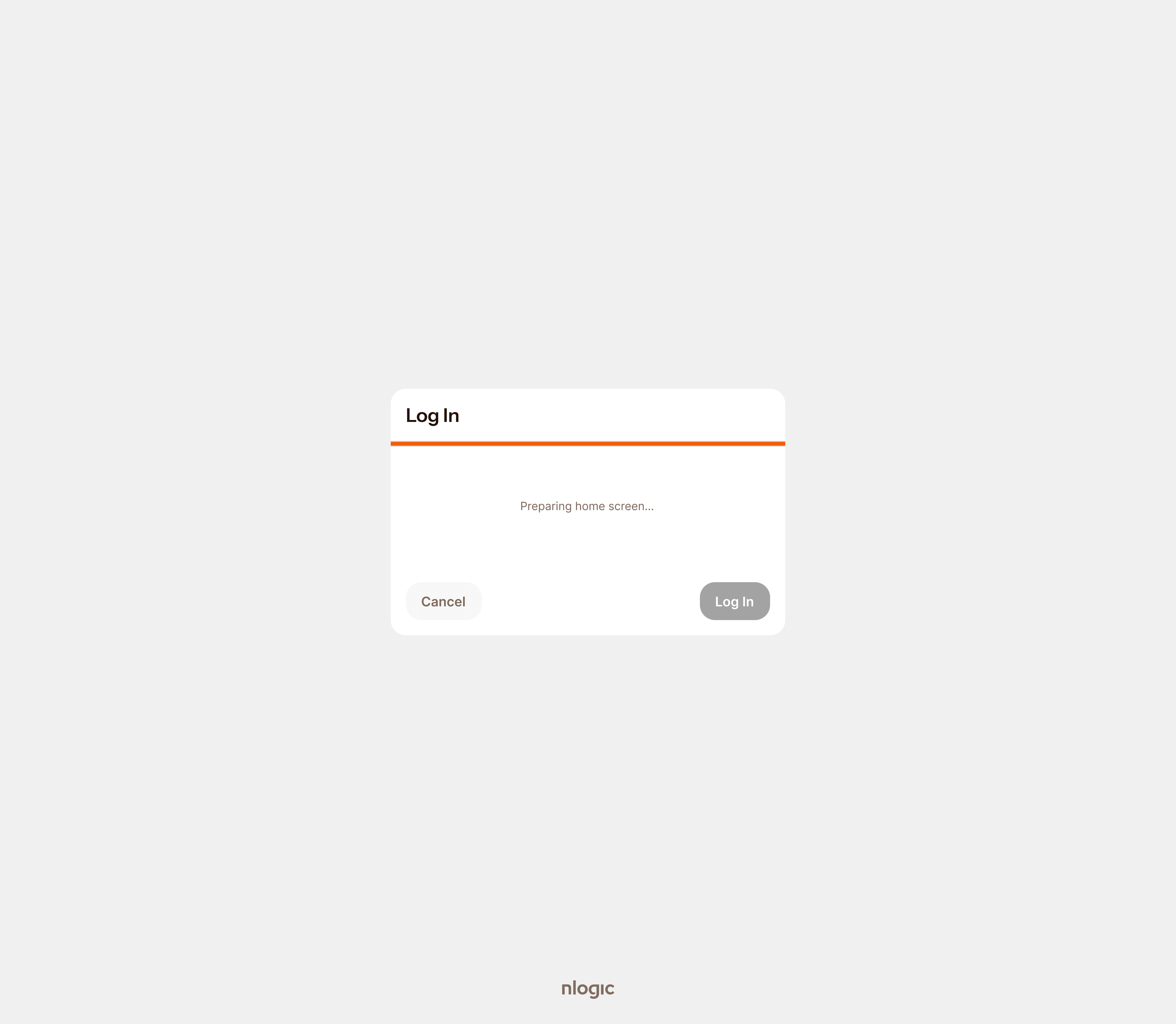
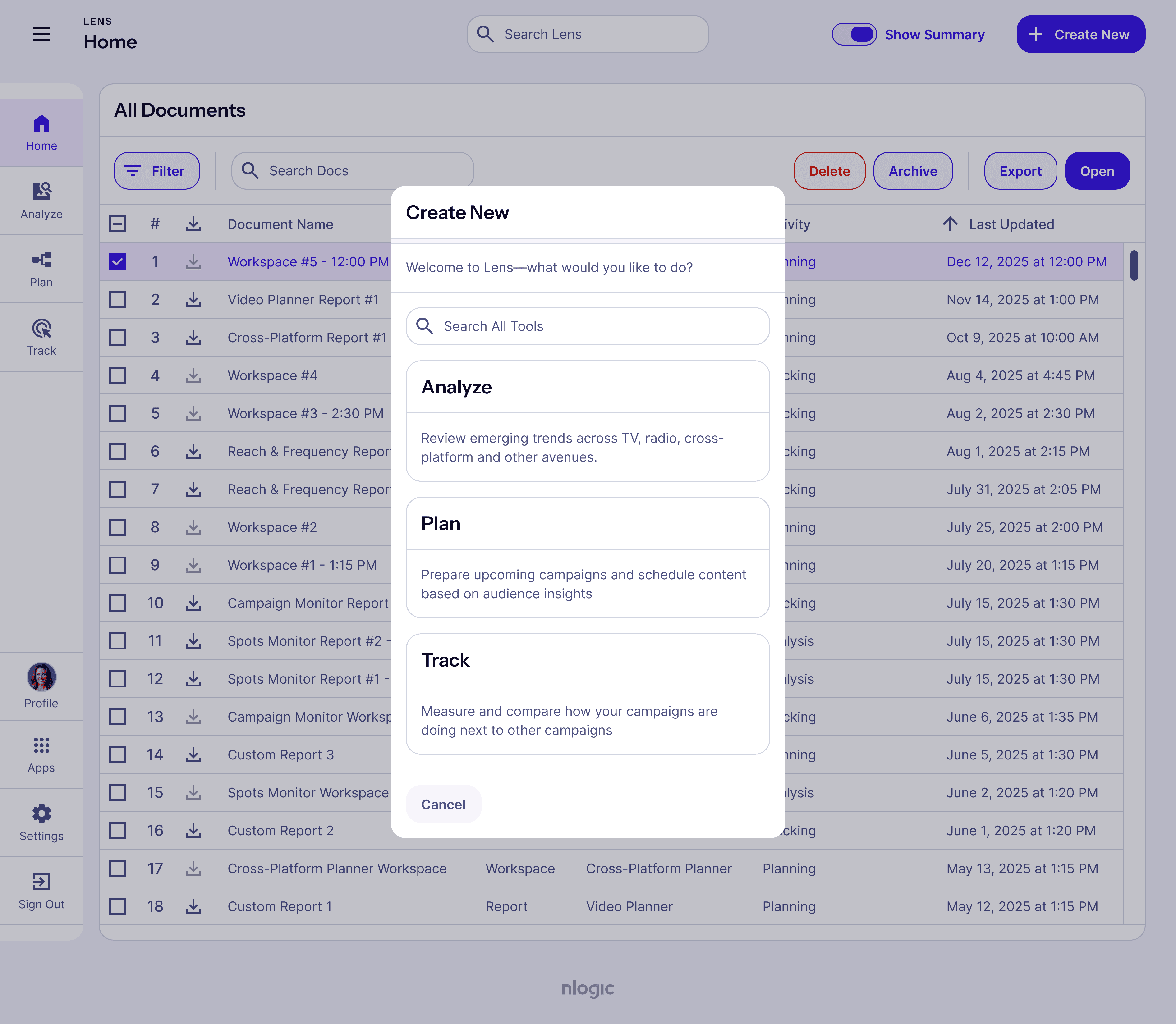
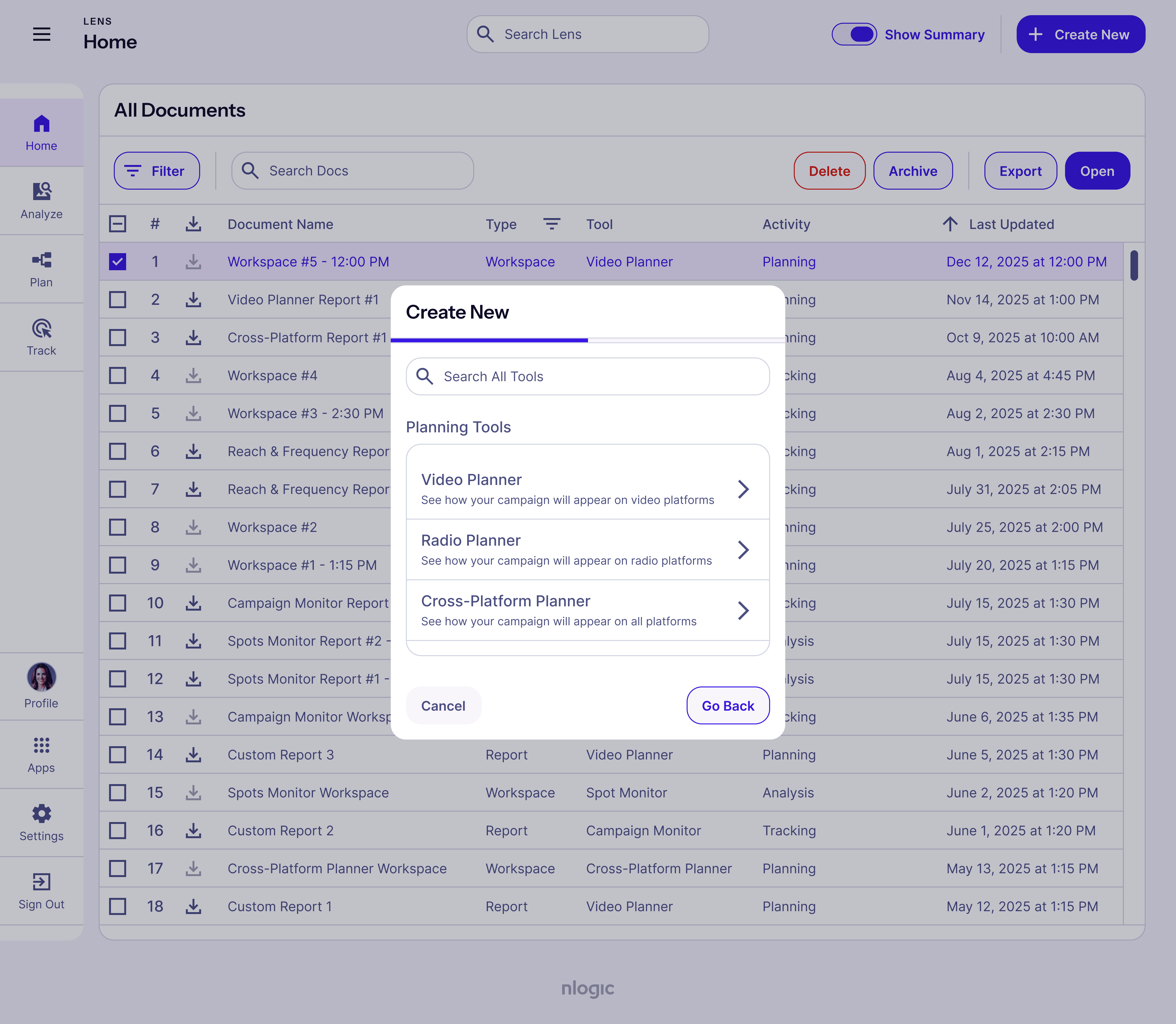
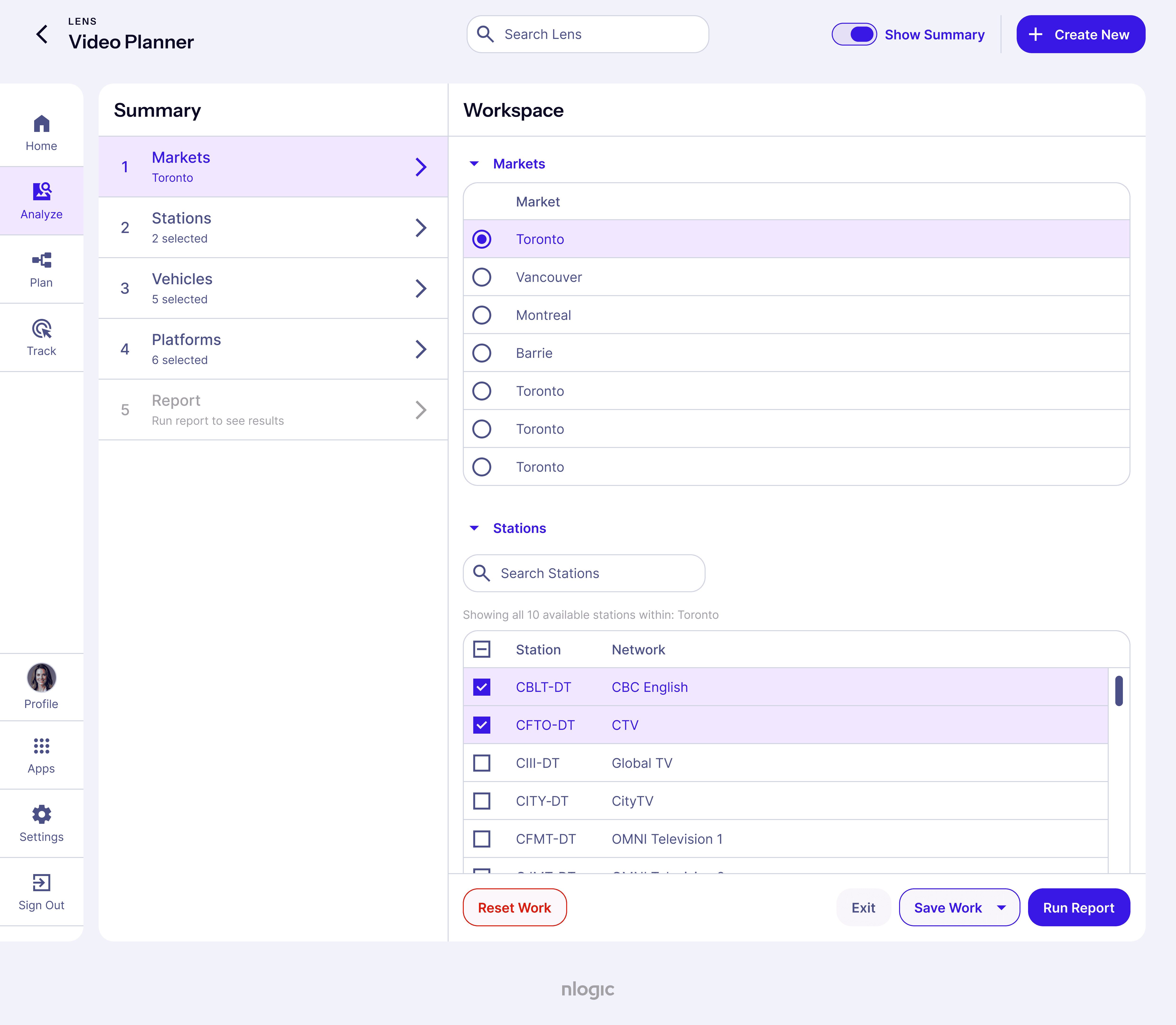
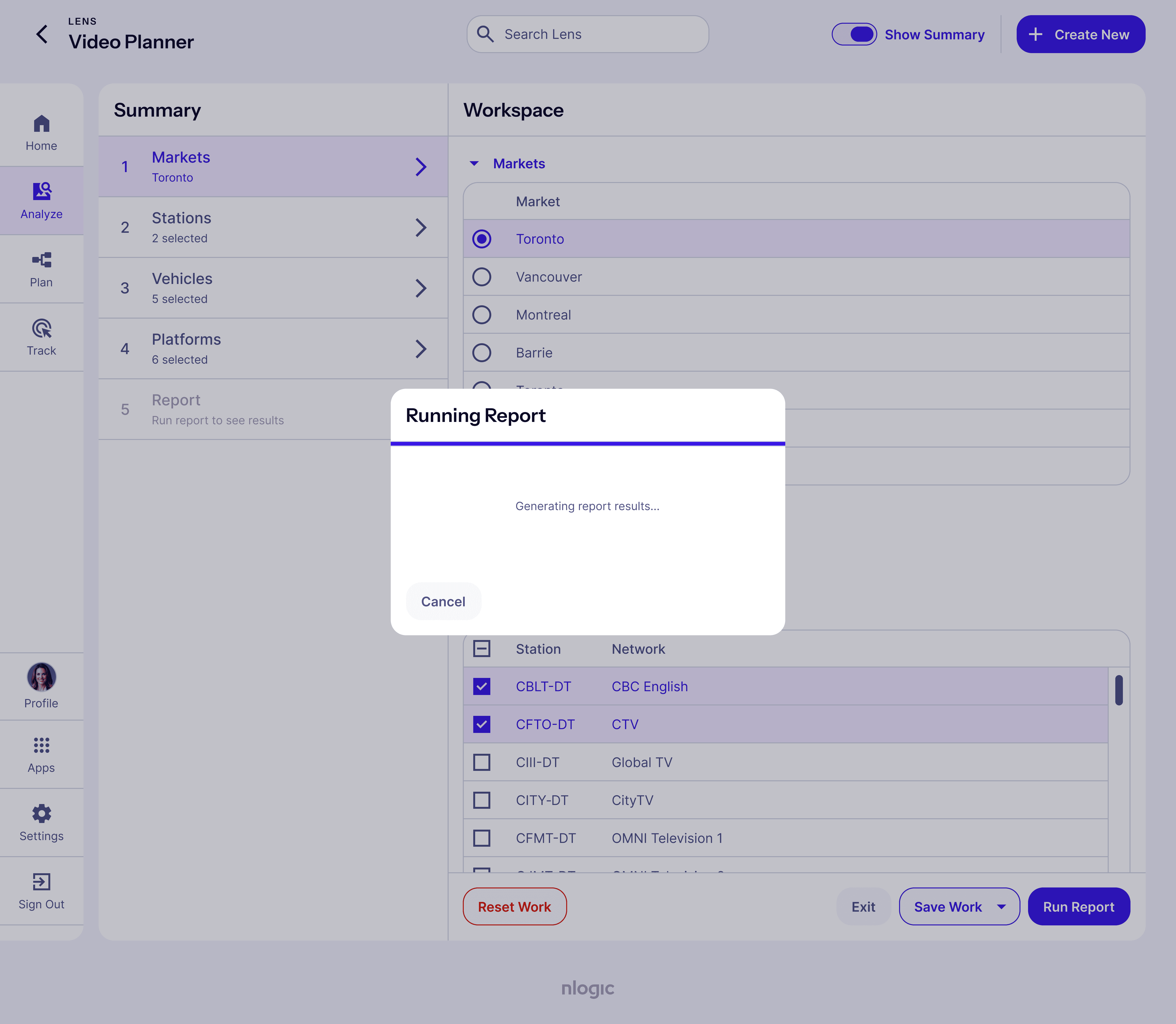
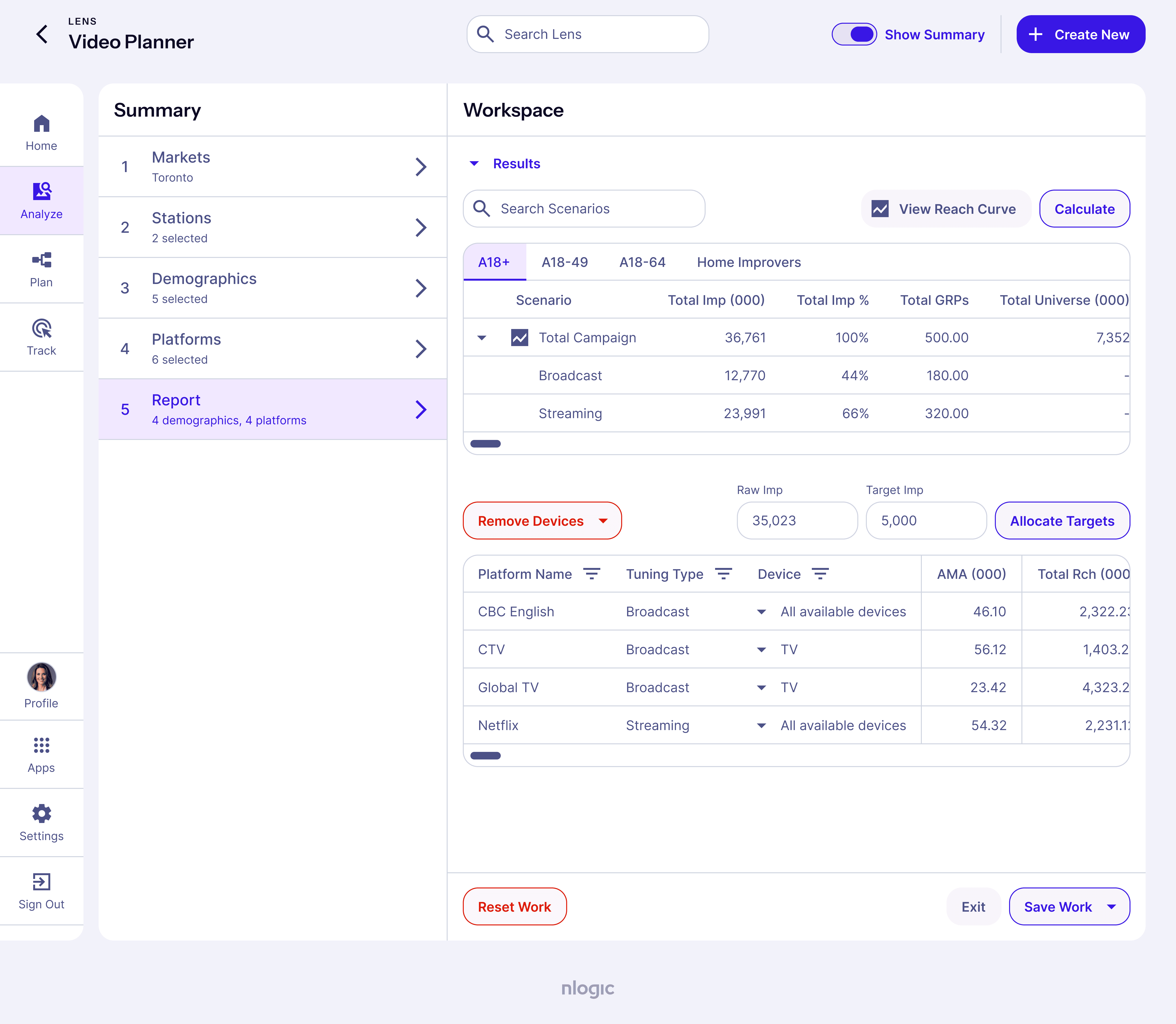
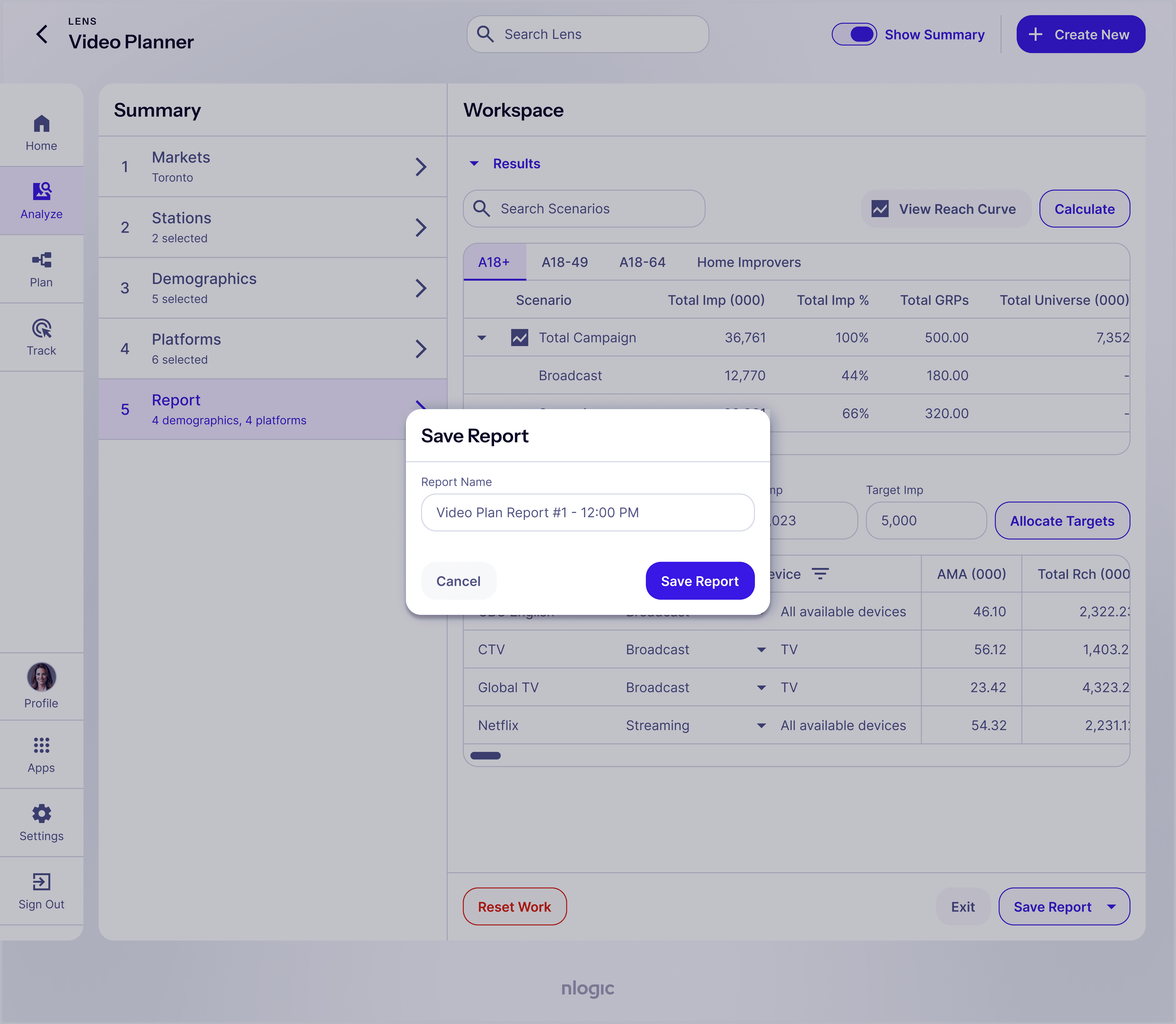
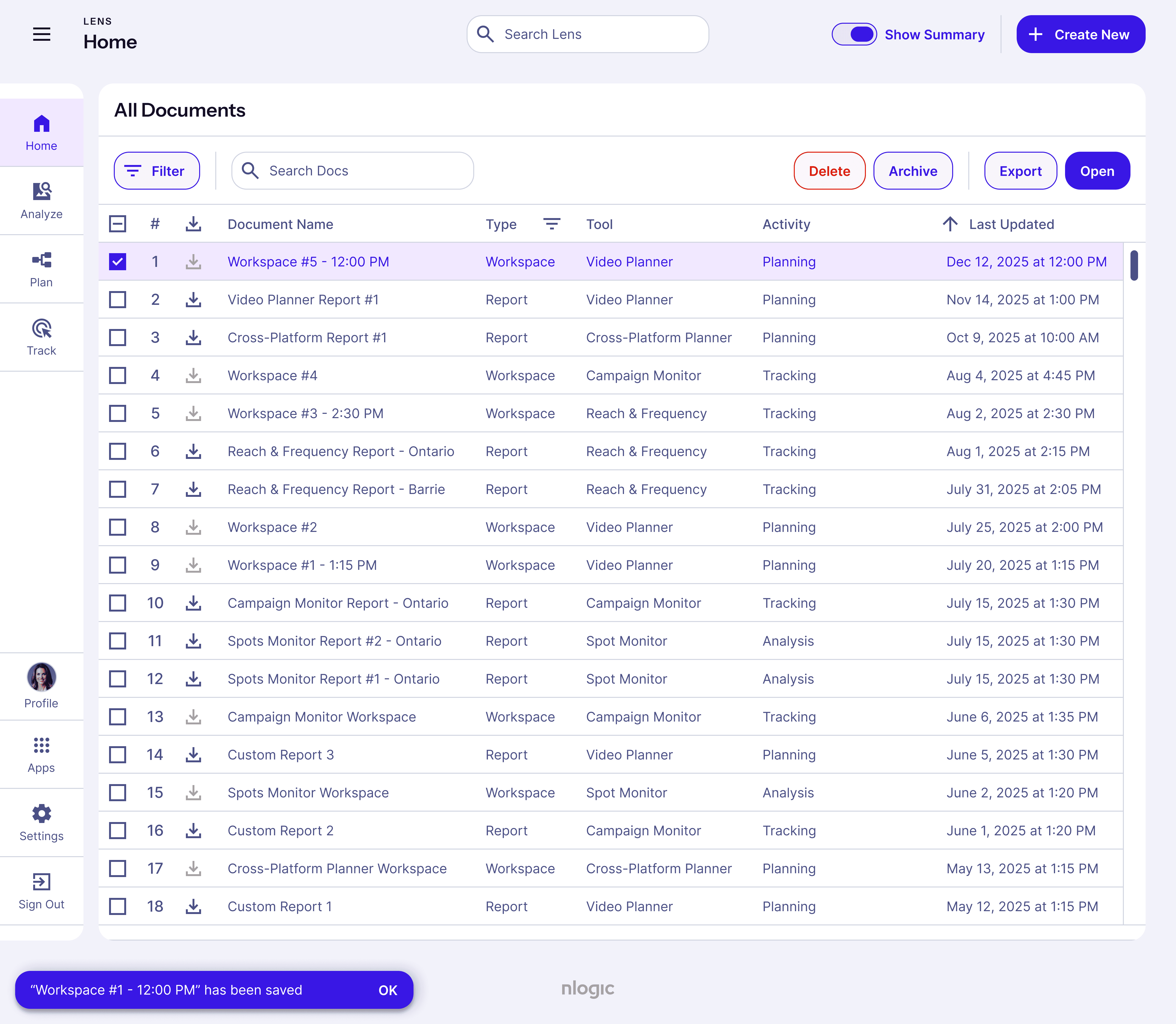
The user flow shows how a user might log in through the nlogic permissions app (app 1) and access Lens (app 2). The steps go as follows; the user logs in through nlogic’s main website and is taken to a single sign-on screen, after which registered users proceed to the Lens dashboard. From there, they click Create New to open a modal and choose an activity—Analyze, Plan, or Track—and in this demo select Plan, then Video Planner, which redirects them to the Video Planner homepage to configure a video-planning report. After reviewing the available options, the user runs the report and sees a loading indicator while it’s generated in the backend. Once complete, the report results populate the page, where the user can expand the workspace by hiding the Summary panel and, if satisfied, export or save the report to access later from the Home dashboard.
The user flow shows how a user might log in through the nlogic permissions app (app 1) and access Lens (app 2). The steps go as follows; the user logs in through nlogic’s main website and is taken to a single sign-on screen, after which registered users proceed to the Lens dashboard. From there, they click Create New to open a modal and choose an activity—Analyze, Plan, or Track—and in this demo select Plan, then Video Planner, which redirects them to the Video Planner homepage to configure a video-planning report. After reviewing the available options, the user runs the report and sees a loading indicator while it’s generated in the backend. Once complete, the report results populate the page, where the user can expand the workspace by hiding the Summary panel and, if satisfied, export or save the report to access later from the Home dashboard.
The user flow shows how a user might log in through the nlogic permissions app (app 1) and access Lens (app 2). The steps go as follows; the user logs in through nlogic’s main website and is taken to a single sign-on screen, after which registered users proceed to the Lens dashboard. From there, they click Create New to open a modal and choose an activity—Analyze, Plan, or Track—and in this demo select Plan, then Video Planner, which redirects them to the Video Planner homepage to configure a video-planning report. After reviewing the available options, the user runs the report and sees a loading indicator while it’s generated in the backend. Once complete, the report results populate the page, where the user can expand the workspace by hiding the Summary panel and, if satisfied, export or save the report to access later from the Home dashboard.
I conducted 50 user tests to ground my designs in reality. I also tested internally; buy-in was the intangible product that made everything easier.
I conducted 50 user tests to ground my designs in reality. I also tested internally; buy-in was the intangible product that made everything easier.
I conducted 50 user tests to ground my designs in reality. I also tested internally; buy-in was the intangible product that made everything easier.
I conducted 50 user tests to ground my designs in reality. I also tested internally; buy-in was the intangible product that made everything easier.
I conducted 50 user tests to ground my designs in reality. I also tested internally; buy-in was the intangible product that made everything easier.
I conducted 50 user tests to ground my designs in reality. I also tested internally; buy-in was the intangible product that made everything easier.
Before the changes, users were confused and needed heavy instruction to use Nlogic’s products. After testing, feedback became consistently positive and confident. Users navigated the products with ease and even taught their teammates. Internally, engineering resistance was valid due to past front end changes that created more work and debt. I addressed this by validating their concerns and showing a clear path forward. I demonstrated how the system translated into simple HTML and CSS, compared the old and new approaches, and clarified the cost tradeoffs. I also translated Material Design guidance and worked alongside a front end developer to turn the system into code, making adoption collaborative rather than a handoff.
Before the changes, users were confused and needed heavy instruction to use Nlogic’s products. After testing, feedback became consistently positive and confident. Users navigated the products with ease and even taught their teammates. Internally, engineering resistance was valid due to past front end changes that created more work and debt. I addressed this by validating their concerns and showing a clear path forward. I demonstrated how the system translated into simple HTML and CSS, compared the old and new approaches, and clarified the cost tradeoffs. I also translated Material Design guidance and worked alongside a front end developer to turn the system into code, making adoption collaborative rather than a handoff.
Before the changes, users were confused and needed heavy instruction to use Nlogic’s products. After testing, feedback became consistently positive and confident. Users navigated the products with ease and even taught their teammates. Internally, engineering resistance was valid due to past front end changes that created more work and debt. I addressed this by validating their concerns and showing a clear path forward. I demonstrated how the system translated into simple HTML and CSS, compared the old and new approaches, and clarified the cost tradeoffs. I also translated Material Design guidance and worked alongside a front end developer to turn the system into code, making adoption collaborative rather than a handoff.
Engineering time shrank by 91%, 60% of users achieved the desired task on first-try without instruction and the design system enabled nlogic's first new revenue product.
Engineering time shrank by 91%, 60% of users achieved the desired task on first-try without instruction and the design system enabled nlogic's first new revenue product.
Engineering time shrank by 91%, 60% of users achieved the desired task on first-try without instruction and the design system enabled nlogic's first new revenue product.
Engineering time shrank by 91%, 60% of users achieved the desired task on first-try without instruction and the design system enabled nlogic's first new revenue product.
Engineering time shrank by 91%, 60% of users achieved the desired task on first-try without instruction and the design system enabled nlogic's first new revenue product.
Engineering time shrank by 91%, 60% of users achieved the desired task on first-try without instruction and the design system enabled nlogic's first new revenue product.
assets
assets
assets
Design System
CreativeOps System
Product Design Strategy
User Tests
Stakeholder Interviews
Mockups
User Flows
Prototypes
Brand Identity
Design System
CreativeOps System
Product Design Strategy
User Tests
Stakeholder Interviews
Mockups
User Flows
Prototypes
Brand Identity
Design System
CreativeOps System
Product Design Strategy
User Tests
Stakeholder Interviews
Mockups
User Flows
Prototypes
Brand Identity
Design System
CreativeOps System
Product Design Strategy
User Tests
Stakeholder Interviews
Mockups
User Flows
Prototypes
Brand Identity
Design System
CreativeOps System
Product Design Strategy
User Tests
Stakeholder Interviews
Mockups
User Flows
Prototypes
Brand Identity
impact
impact
impact
24x increase in design-engineering speed
24x increase in design-engineering speed
24x increase in design-engineering speed
24x increase in design-engineering speed
The avg time to achieve design accuracy went from 11 months to 2 weeks
The avg time to achieve design accuracy went from 11 months to 2 weeks
The avg time to achieve design accuracy went from 11 months to 2 weeks
60% first-try user task success rate
60% first-try user task success rate
60% first-try user task success rate
60% first-try user task success rate
The products proved self-instructional; 60% of users were able to complete their desired task on first-try without additional guidance (up from 10-20%)
The products proved self-instructional; 60% of users were able to complete their desired task on first-try without additional guidance (up from 10-20%)
The products proved self-instructional; 60% of users were able to complete their desired task on first-try without additional guidance (up from 10-20%)
87% company-wide collaboration satisfaction
87% company-wide collaboration satisfaction
87% company-wide collaboration satisfaction
87% company-wide collaboration satisfaction
Surveyed across a team of 30–50 people, the design system improved cross-functional alignment between design, engineering, product management and client services departments.
Surveyed across a team of 30–50 people, the design system improved cross-functional alignment between design, engineering, product management and client services departments.
Surveyed across a team of 30–50 people, the design system improved cross-functional alignment between design, engineering, product management and client services departments.
+1 new product + launch event
+1 new product + launch event
+1 new product + launch event
+1 new product + launch event
The design system paved the way for a new product launch, generating 6-figure revenue for the business in its' first year.
The design system paved the way for a new product launch, generating 6-figure revenue for the business in its' first year.
The design system paved the way for a new product launch, generating 6-figure revenue for the business in its' first year.
0.5-2 day avg turn-around time
0.5-2 day avg turn-around time
0.5-2 day avg turn-around time
0.5-2 day avg turn-around time
Complex designs could be created in a much shorter span of time compared to the initial 2-4 week turnaround time with the previous design system.
Complex designs could be created in a much shorter span of time compared to the initial 2-4 week turnaround time with the previous design system.
Complex designs could be created in a much shorter span of time compared to the initial 2-4 week turnaround time with the previous design system.